Redesigning thememorial onboarding
Enhancing User Engagement & Conversion
CLIENT
Memories
ROLE
Product designer (UX/UI, research)
LOCATION
Melbourne
DURATION
4 Months (2022)
oUTPUT
- Responsive onboarding flow
- Responsive home page redesign
TEAM
Head of product, PM, 2 Designers, 4 Devs, Copywriter, Marketing
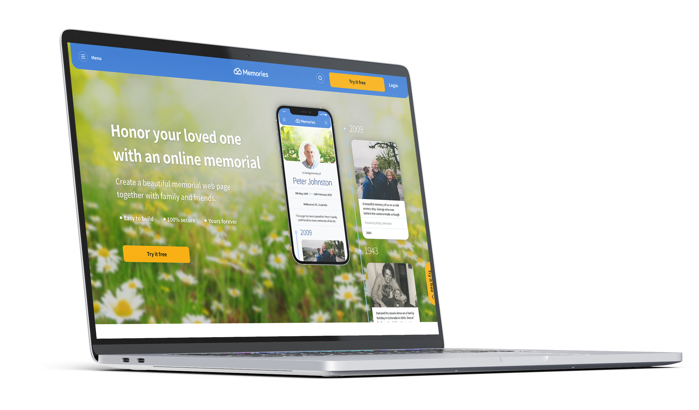
Overview
In 2021, Memories moved to a paid-only model for its core product, the online memorial. This led to a significant drop in sign-ups, activations, and conversions.
We identified two key issues beyond pricing: many users struggled to understand the product’s value, which increased refund requests, and requiring upfront payment before users understood its purpose created hesitation, especially given the product’s sensitive nature.
Hypothesis
Analysis of initial support tickets showed many users purchased the product but later realised it didn’t meet their expectations. This hesitation was due to users struggling to understand its value upfront and being required to pay before fully experiencing it, especially given the product’s sensitive nature, which led to many refund requests.
Together with the product team, we identified three priorities to improve the experience:
- Clarify the product value proposition on the website to help users quickly understand what the product offers and why it matters.
- Introduce a free trial to lower the entry barrier, build trust, and allow users to engage with the product before committing financially.
- Simplify the onboarding flow to reduce friction and make the first steps easier, clearer, and more supportive when engaging with a sensitive product.
Goals
1. Improve Sign-ups
Help users understand the benefits of the online memorial by testing and refining the value proposition.
2. Increase Memorial Activation/Creation
Simplify the onboarding process to make completing memorials easier and faster.
3. Boost Conversions
Introduce a free trial to let users experience the platform before committing financially.
Double Diamond
Design Process
Discovery
Kick-off workshop
Support Request Analysis
Funnel Analysis
User interviews
Ideation workshop
Features definition
Wireframes
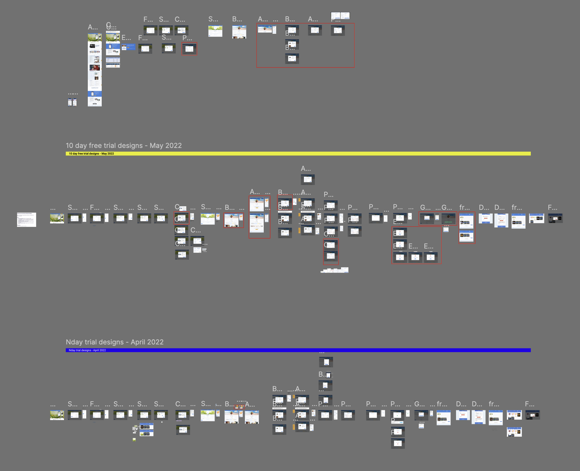
Concept testing
Iterate
Synthesise insights
Persona
Journey map
Build
Test
Analyse & iterate
Define
Develop
Deliver

Mixed-Methods
Research
I combined qualitative and quantitative methods to gain a well-rounded understanding of user needs, product performance, and business alignment.
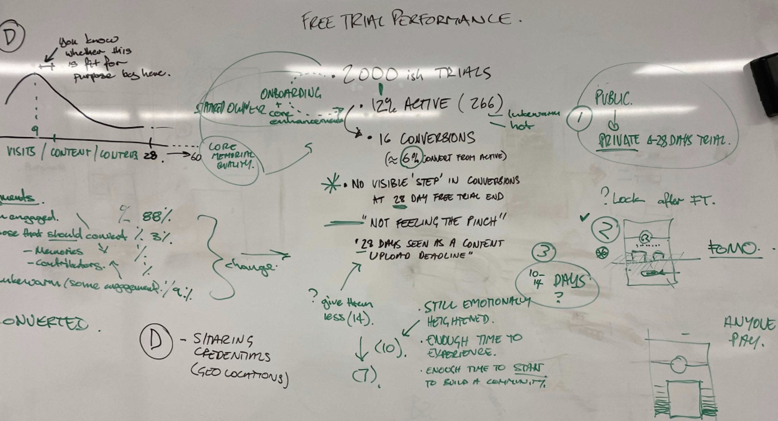
1. Onboarding Funnel Analysis
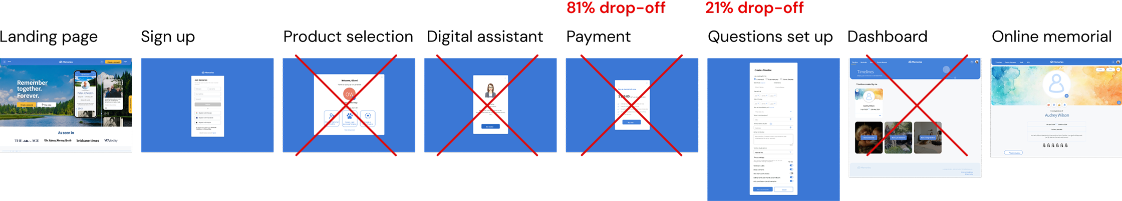
To identify where users were disengaging or encountering friction during onboarding, I collaborated with head of product to review the funnel data in Google Analytics.
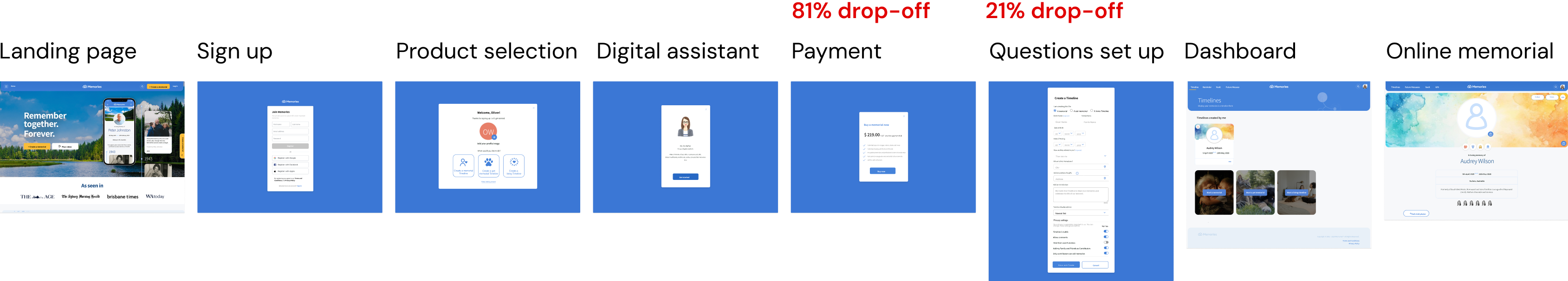
key insights emerged:
- A significant drop-off occurred at the payment step, indicating user hesitation around financial commitment.
- Users spent a disproportionate amount of time on the questionnaire screen, suggesting that it was cognitively demanding or unclear, and potentially acting as a blocker in the flow.
- Support Request Analysis
We reviewed fortnightly support tickets and identified recurring issues around refunds and unmet user expectations.
key insight:
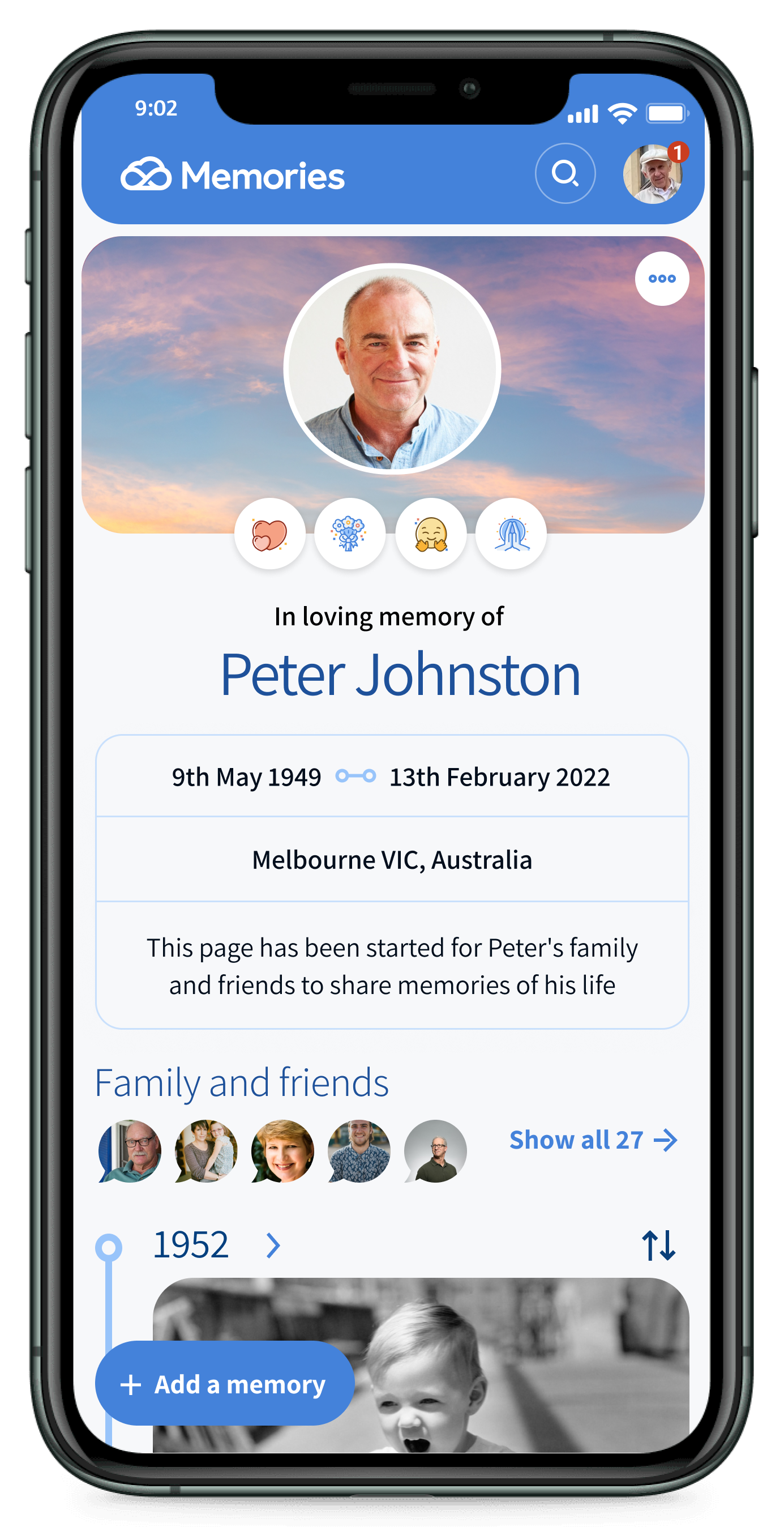
Many users signed up expecting to create a death notice, unaware that our product served a different purpose—clearly highlighting that our value proposition and website copy needed to be clarified.
- User Interviews
To understyand friccion points, purchase desiction, and possible areas of improvements.
key insight:
Value Proposition: Users expressed strong interest but needed to experience the service to understand its value before committing; a free trial was highly desired.
Onboarding: The existing onboarding felt lengthy, with some questions perceived as confusing or irrelevant.
Payment: The upfront payment and its tone felt too transactional during a time of grief; users were hesitant to commit to a one-time payment memorial when asked for credit card details before experiencing the value of the product.
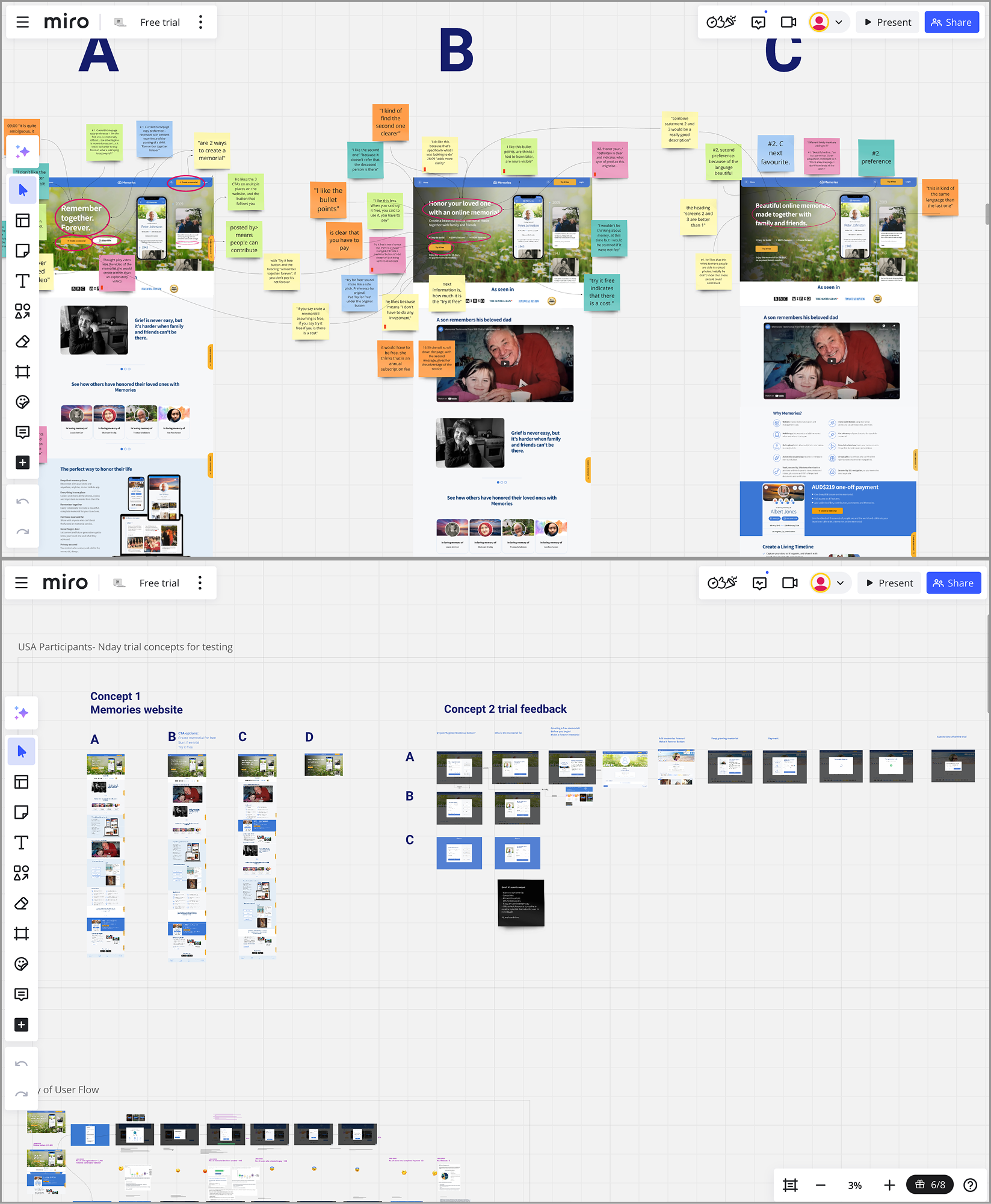
- Concept Testing Insights
We ran concept testing with six representative users using early mock-ups to validate assumptions and iterate quickly.
key insights:
Core values: Users appreciated features such as ease of use, collaboration, privacy, and emotional connection.
Clarity Language: Consistently using the term ‘online memorial’ in messaging significantly improved the perceived value proposition.
Empathetic Language: An empathetic and compassionate tone positively influenced purchase decisions and memorial creation.
Social Proof & Trust: Testimonials and brand partnerships enhanced credibility and comfort during a sensitive time.
CTAs: The “Try it free” button effectively indicated that there was a cost associated with the service without using overtly transactional language.
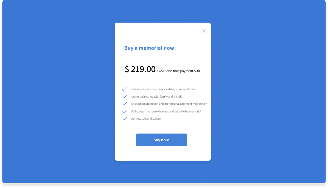
Pricing: Users appreciated the $219 AUD one-time fee but noted a preference for smaller, ongoing payments over subscriptions.
Onboarding Simplification: Removing three steps streamlined the process; example memorials provided clear inspiration for users.
Memorial owner
User Persona
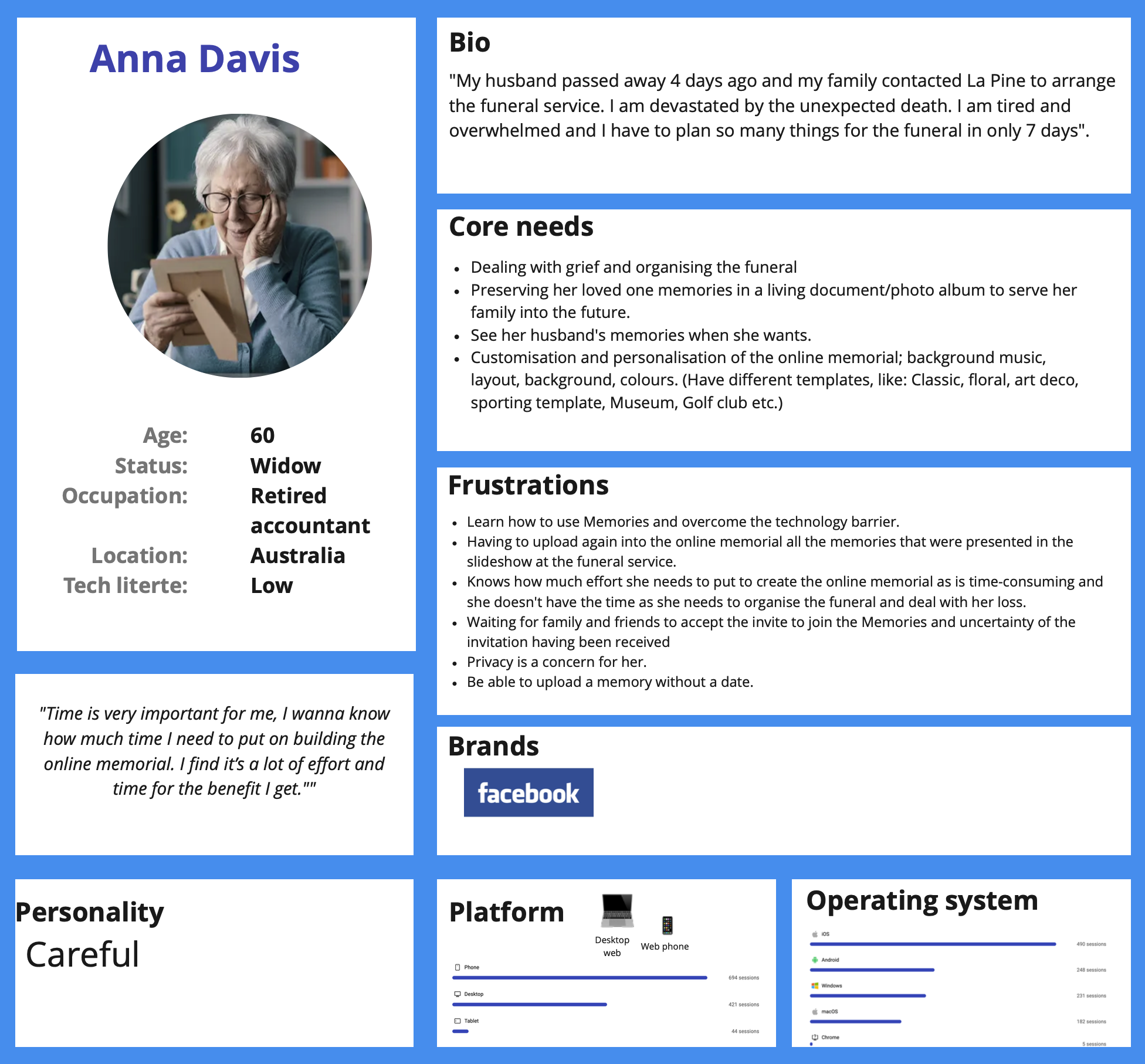
Memorial Owner — initiates and manages the memorial and invites others to contribute.
Memorial owner
Journey Map
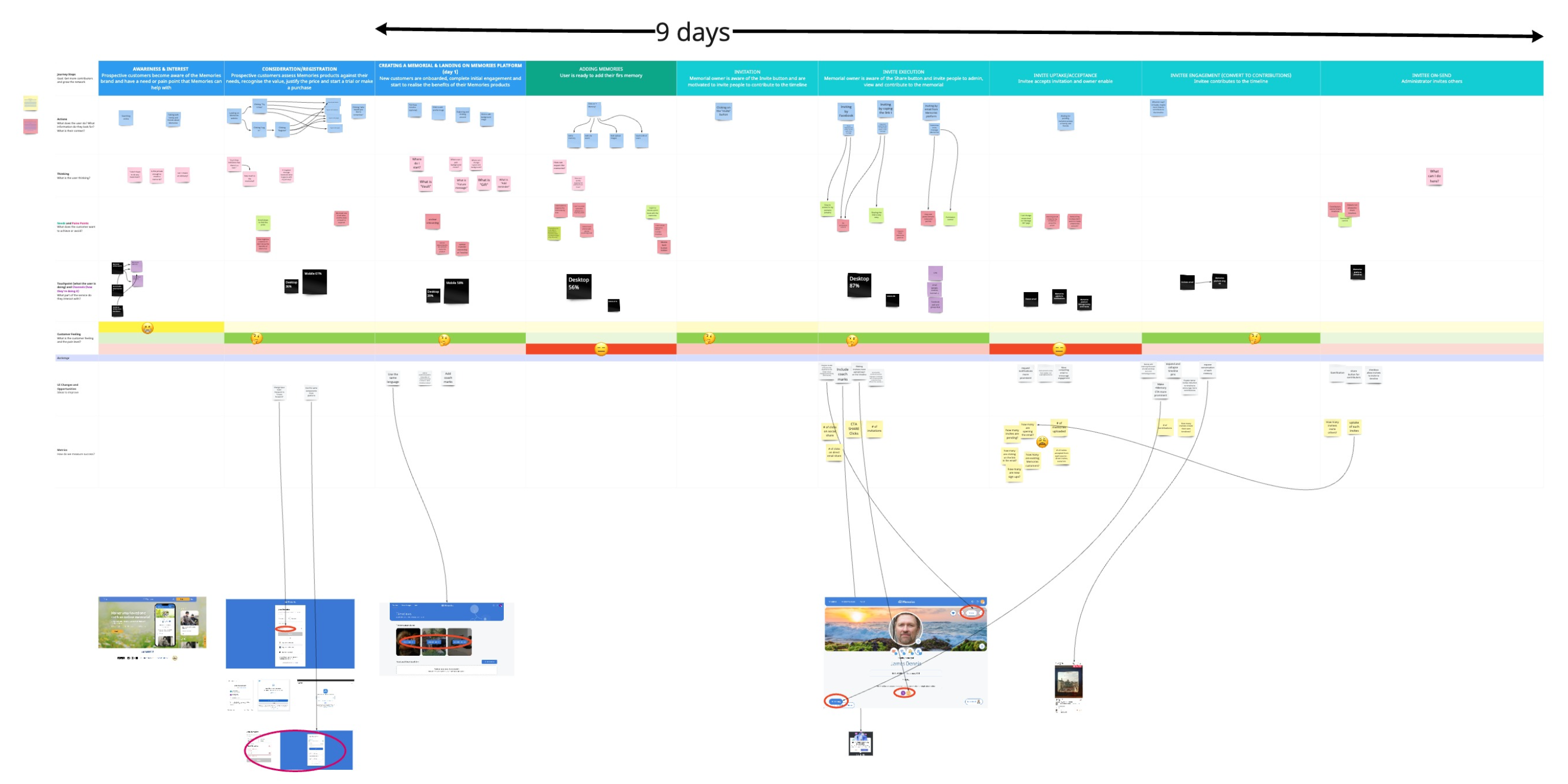
Mapped the journey of a typical Memorial Owner from discovering the service to creating a memorial,highlighting pain points such as complex onboarding and unclear value proposition during the initial experience.
Initial User Flow
Proposed User Flow

Proposed UX Redesign
1. Website Enhancements:
- Refined website copy to be more supportive, reassuring, warm, and empathetic.
- Introduced softer visual elements and calming colours.
- Clearly emphasised core benefits: easy setup, private & secure, collaborative, one-time payment.
2. Introducing a Free Trial:
- Eliminated upfront payment, launching a 28-day free trial.
- Added prompts highlighting memorial and trial benefits throughout the user journey.
- Clearly outlined trial terms to manage expectations.
- Presented a memorial summary pre-payment to showcase its built value.
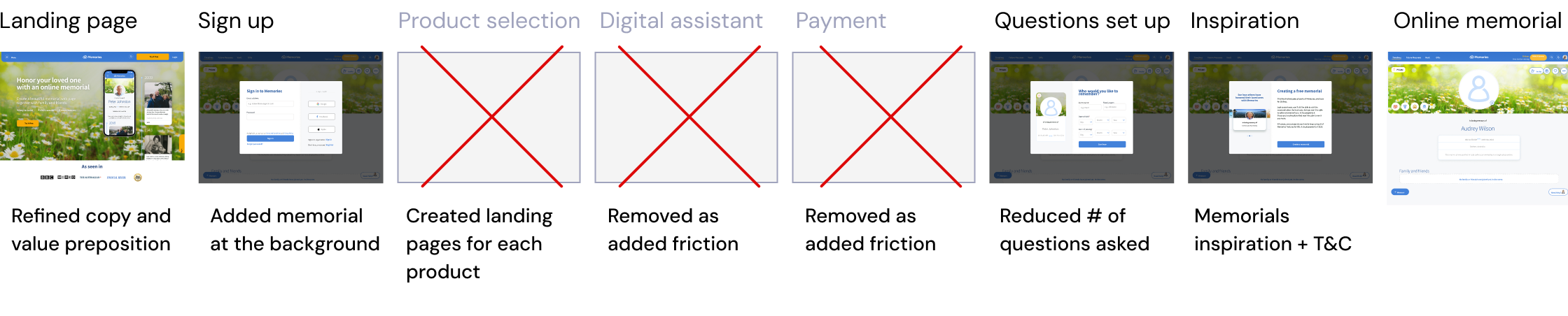
3. Optimising Onboarding Flow:
- Streamlined onboarding from 6 to 3 steps for smooth, more user-friendly experience.
- Simplified sign-up by removing non-essential fields (e.g., "hometown").
- Added sample memorials for inspiration and clarity.
- Integrated an interactive memorial preview in the background for a more immersive experience.
4. UX & Accessibility Considerations:
- With 61% of users creating memorials on mobile, so we prioritised a mobile-first approach to ensure a consistent, responsive experience across devices.
- To support our primary users—older adults with low digital literacy—and meet WCAG Level AA standards (recommended mid-level accessibility), we:
- Reviewed colour choices to ensure sufficient contrast and optimal readability
- Maintained consistent navigation and clear error suggestions
- Implemented larger fonts with a minimum size of 16px
- Designed bigger touch targets (buttons), especially for mobile users
After Six Weeks
Results
Following the launch of the free trial, improved onboarding and the Memories website, we saw significant results within six weeks:
- Improved Conversion Rate: +6%
- Increased Sign-Ups: +28%
- Higher Activation Rate: +12%
Iterations
Based on ongoing analysis of user feedback and product metrics, we continuously refined the experience to better meet user and business needs.
- Reduced Free Trial Duration: Shortened from 28 to 14 days to encourage quicker conversion.
- Increased Pricing Visibility: Moved pricing information higher on the website for earlier clarity.
- Onboarding Product Explainer Video: Added to quickly convey value and features.
- Guided Onboarding: Implemented contextual tooltips for step-by-step user guidance.
KEY
Learnings
- Combining qualitative insights with quantitative validation uncovers real user pain points and informs user-centred design solutions that deliver measurable business impact.
- Storytelling helped make research insights more engaging and actionable for stakeholders.
- Early cross-functional collaboration ensures design changes align with broader business goals.
- Iterative design (progress over perfection) enables continuous improvement.
NEXT CASE STUDY
IKEA Digital Touchpoints

Redesigning thememorial onboarding
Enhancing user activation and conversion
CLIENT
Memories
ROLE
Product designer (UX/UI, research)
DURATION
4 Months (2022)
TEAM
Head of product, PM, 2 Designers, 4 Devs, Copywriter, Marketing
LOCATION
Melbourne
oUTPUT
- Responsive onboarding flow
- Responsive home page redesign
Overview
In 2021, Memories moved to a paid-only model for its core product, the online memorial. This led to a significant drop in sign-ups, activations, and conversions.
We identified two key issues beyond pricing: many users struggled to understand the product’s value, which increased refund requests, and requiring upfront payment before users understood its purpose created hesitation, especially given the product’s sensitive nature.
Hypothesis
Analysis of initial support tickets showed many users purchased the product but later realised it didn’t meet their expectations. This hesitation was due to users struggling to understand its value upfront and being required to pay before fully experiencing it, especially given the product’s sensitive nature, which led to many refund requests.
Together with the product team, we identified three priorities to improve the experience:
- Clarify the product value proposition on the website to help users quickly understand what the product offers and why it matters.
- Introduce a free trial to lower the entry barrier, build trust, and allow users to engage with the product before committing financially.
- Simplify the onboarding flow to reduce friction and make the first steps easier, clearer, and more supportive when engaging with a sensitive product.
Goals
1. Improve Sign-ups
Help users understand the benefits of the online memorial by testing and refining the value proposition.
2. Increase Memorial Activation/Creation
Simplify the onboarding process to make completing memorials easier and faster.
3. Boost Conversions
Introduce a free trial to let users experience the platform before committing financially.
Double Diamond
Design Process
Discovery
Kick-off workshop
Support Request Analysis
Funnel Analysis
User interviews
Ideation workshop
Features definition
Wireframes
Concept testing
Iterate
Synthesise insights
Persona
Journey map
Build
Test
Analyse & iterate
Define
Develop
Deliver

Mixed-Methods
Research
I combined qualitative and quantitative methods to gain a well-rounded understanding of user needs, product performance, and business alignment.
1. Onboarding Funnel Analysis
To identify where users were disengaging or encountering friction during onboarding, I collaborated with head of product to review the funnel data in Google Analytics.
key insights emerged:
- A significant drop-off occurred at the payment step, indicating user hesitation around financial commitment.
- Users spent a disproportionate amount of time on the questionnaire screen, suggesting that it was cognitively demanding or unclear, and potentially acting as a blocker in the flow.
- Support Request Analysis
We reviewed fortnightly support tickets and identified recurring issues around refunds and unmet user expectations.
key insight:
Many users signed up expecting to create a death notice, unaware that our product served a different purpose—clearly highlighting that our value proposition and website copy needed to be clarified.
- User Interviews
To understyand friccion points, purchase desiction, and possible areas of improvements.
key insight:
Value Proposition: Users expressed strong interest but needed to experience the service to understand its value before committing; a free trial was highly desired.
Onboarding: The existing onboarding felt lengthy, with some questions perceived as confusing or irrelevant.
Payment: The upfront payment and its tone felt too transactional during a time of grief; users were hesitant to commit to a one-time payment memorial when asked for credit card details before experiencing the value of the product.
- Concept Testing Insights
We ran concept testing with six representative users using early mock-ups to validate assumptions and iterate quickly.
key insights:
Core values: Users appreciated features such as ease of use, collaboration, privacy, and emotional connection.
Clarity Language: Consistently using the term ‘online memorial’ in messaging significantly improved the perceived value proposition.
Empathetic Language: An empathetic and compassionate tone positively influenced purchase decisions and memorial creation.
Social Proof & Trust: Testimonials and brand partnerships enhanced credibility and comfort during a sensitive time.
CTAs: The “Try it free” button effectively indicated that there was a cost associated with the service without using overtly transactional language.
Pricing: Users appreciated the $219 AUD one-time fee but noted a preference for smaller, ongoing payments over subscriptions.
Onboarding Simplification: Removing three steps streamlined the process; example memorials provided clear inspiration for users.
- A/B Testing & Data-Driven Optimisation
Test 1: CTA Button Language
- Concept Testing Findings Used: Users responded more positively to wording that emphasised the trial rather than the memorial creation.
- Hypothesis: A more descriptive and action-driven CTA would encourage more sign-ups.
- Variation A: “Try it free”
- Variation B: “Create a memorial for free”
- Result: Variation A (Try it free) performed better in sign-ups.
Test 2: Homepage Layout
- Concept Testing Findings Used: Early testing suggested that trust-building elements, such as testimonials, could play a crucial role in influencing purchase decisions.
- Hypothesis: Placing the testimonials section at the top would increase trust and incentivise the purchase process and increase conversions.
- Variation A: Payment section displayed at the top of the page.
- Variation B: Testimonials displayed at the top of the page.
- Result: Variation B (testimonials first) led to increase in conversion rates.
Memorial owner
User Persona
Memorial Owner — initiates and manages the memorial and invites others to contribute.
Memorial owner
Journey Map
Mapped the journey of a typical Memorial Owner from discovering the service to creating a memorial,highlighting pain points such as complex onboarding and unclear value proposition during the initial experience.
Initial User Flow
Proposed User Flow
Proposed UX Redesign
1. Website Enhancements:
- Refined website copy to be more supportive, reassuring, warm, and empathetic.
- Introduced softer visual elements and calming colours.
- Clearly emphasised core benefits: easy setup, private & secure, collaborative, one-time payment.
2. Introducing a Free Trial:
- Eliminated upfront payment, launching a 28-day free trial.
- Added prompts highlighting memorial and trial benefits throughout the user journey.
- Clearly outlined trial terms to manage expectations.
- Presented a memorial summary pre-payment to showcase its built value.
3. Optimising Onboarding Flow:
- Streamlined onboarding from 6 to 3 steps for smooth, more user-friendly experience.
- Simplified sign-up by removing non-essential fields (e.g., "hometown").
- Added sample memorials for inspiration and clarity.
- Integrated an interactive memorial preview in the background for a more immersive experience.
4. UX & Accessibility Considerations:
- With 61% of users creating memorials on mobile, so we prioritised a mobile-first approach to ensure a consistent, responsive experience across devices.
- To support our primary users—older adults with low digital literacy—and meet WCAG Level AA standards (recommended mid-level accessibility), we:
- Reviewed colour choices to ensure sufficient contrast and optimal readability
- Maintained consistent navigation and clear error suggestions
- Implemented larger fonts with a minimum size of 16px
- Designed bigger touch targets (buttons), especially for mobile users
After Six Weeks
Results
Following the launch of the free trial, improved onboarding and the Memories website, we saw significant results within six weeks:
- Improved Conversion Rate: +6%
- Increased Sign-Ups: +28%
- Higher Activation Rate: +12%
Iterations
Based on ongoing analysis of user feedback and product metrics, we continuously refined the experience to better meet user and business needs.
- Reduced Free Trial Duration: Shortened from 28 to 14 days to encourage quicker conversion.
- Increased Pricing Visibility: Moved pricing information higher on the website for earlier clarity.
- Onboarding Product Explainer Video: Added to quickly convey value and features.
- Guided Onboarding: Implemented contextual tooltips for step-by-step user guidance.
KEY
Learnings
- Combining qualitative insights with quantitative validation uncovers real user pain points and informs user-centred design solutions that deliver measurable business impact.
- Storytelling helped make research insights more engaging and actionable for stakeholders.
- Early cross-functional collaboration ensures design changes align with broader business goals.
- Iterative design (progress over perfection) enables continuous improvement.
NEXT CASE STUDY
IKEA Digital Touchpoints
Redesigning thememorial onboarding
Enhancing user activation and conversion
CLIENT
Memories
ROLE
Senior product designer (UX/UI, research, strategy)
DURATION
4 Months (2022)
TEAM
Head of product, PM, 2 Designers, 4 Devs, Copywriter, Marketing
LOCATION
Melbourne
oUTPUT
- Responsive onboarding flow
- Responsive home page redesign
Overview
In 2021, Memories moved to a paid-only model for its core product, the online memorial. This led to a significant drop in sign-ups, activations, and conversions.
Hypothesis
Analysis of initial support tickets showed many users purchased the product but later realised it didn’t meet their expectations. This hesitation was due to users struggling to understand its value upfront and being required to pay before fully experiencing it, especially given the product’s sensitive nature, which led to many refund requests.
Together with the product team, we identified three priorities to improve the experience:
- Clarify the product value proposition on the website to help users quickly understand what the product offers and why it matters.
- Introduce a free trial to lower the entry barrier, build trust, and allow users to engage with the product before committing financially.
- Simplify the onboarding flow to reduce friction and make the first steps easier, clearer, and more supportive when engaging with a sensitive product.
Goals
1. Improve Sign-ups
Help users understand the benefits of the online memorial by testing and refining the value proposition.
2. Increase Memorial Activation/Creation
Simplify the onboarding process to make completing memorials easier and faster.
3. Boost Conversions
Introduce a free trial to let users experience the platform before committing financially.
Double Diamond
Design Process
Discovery
Kick-off workshop
Support Request Analysis
Funnel Analysis
User interviews
Ideation workshop
Features definition
Wireframes
Concept testing
Iterate
Synthesise insights
Persona
Journey map
Build
Test
Analyse & iterate
Define
Develop
Deliver

Mixed-Methods
Research
I combined qualitative and quantitative methods to gain a well-rounded understanding of user needs, product performance, and business alignment.
1. Onboarding Funnel Analysis
To identify where users were disengaging or encountering friction during onboarding, I collaborated with head of product to review the funnel data in Google Analytics.
key insights emerged:
- A significant drop-off occurred at the payment step, indicating user hesitation around financial commitment.
- Users spent a disproportionate amount of time on the questionnaire screen, suggesting that it was cognitively demanding or unclear, and potentially acting as a blocker in the flow.
- Support Request Analysis
We reviewed fortnightly support tickets and identified recurring issues around refunds and unmet user expectations.
key insight:
Many users signed up expecting to create a death notice, unaware that our product served a different purpose—clearly highlighting that our value proposition and website copy needed to be clarified.
- User Interviews
Despite the challenges of scheduling interviews in a grieving context, we spoke with six Memories users to understand friction points, purchase decisions, and opportunities for improvement.
key insights:
Value Proposition: Users expressed strong interest but needed to experience the service to understand its value before committing; a free trial was highly desired.
Onboarding: The existing onboarding felt lengthy, with some questions perceived as confusing or irrelevant.
Payment: The upfront payment and its tone felt too transactional during a time of grief; users were hesitant to commit to a one-time payment memorial when asked for credit card details before experiencing the value of the product.
- Concept Testing Insights
We ran concept testing with six representative users using early mock-ups to validate assumptions and iterate quickly.
key insights:
Core values: Users appreciated features such as ease of use, collaboration, privacy, and emotional connection.
Clarity Language: Consistently using the term ‘online memorial’ in messaging significantly improved the perceived value proposition.
Empathetic Language: An empathetic and compassionate tone positively influenced purchase decisions and memorial creation.
Social Proof & Trust: Testimonials and brand partnerships enhanced credibility and comfort during a sensitive time.
CTAs: The “Try it free” button effectively indicated that there was a cost associated with the service without using overtly transactional language.
Pricing: Users appreciated the $219 AUD one-time fee but noted a preference for smaller, ongoing payments over subscriptions.
Onboarding Simplification: Removing three steps streamlined the process; example memorials provided clear inspiration for users.
- A/B Testing & Data-Driven Optimisation
Test 1: CTA Button Language
- Concept Testing Findings Used: Users responded more positively to wording that emphasised the trial rather than the memorial creation.
- Hypothesis: A more descriptive and action-driven CTA would encourage more sign-ups.
- Variation A: “Try it free”
- Variation B: “Create a memorial for free”
- Result: Variation A (Try it free) performed better in sign-ups.
Test 2: Homepage Layout
- Concept Testing Findings Used: Early testing suggested that trust-building elements, such as testimonials, could play a crucial role in influencing purchase decisions.
- Hypothesis: Placing the testimonials section at the top would increase trust and incentivise the purchase process and increase conversions.
- Variation A: Payment section displayed at the top of the page.
- Variation B: Testimonials displayed at the top of the page.
- Result: Variation B (testimonials first) led to increase in conversion rates.
Memorial owner
User Persona
Memorial Owner — initiates and manages the memorial and invites others to contribute.
Memorial owner
Journey Map
Mapped the journey of a typical Memorial Owner from discovering the service to creating a memorial,highlighting pain points such as complex onboarding and unclear value proposition during the initial experience.
Initial User Flow
Proposed User Flow

Proposed UX Redesign
1. Website Enhancements:
- Refined website copy to be more supportive, reassuring, warm, and empathetic.
- Introduced softer visual elements and calming colours.
- Clearly emphasised core benefits: easy setup, private & secure, collaborative, one-time payment.
2. Introducing a Free Trial:
- Eliminated upfront payment, launching a 28-day free trial.
- Added prompts highlighting memorial and trial benefits throughout the user journey.
- Clearly outlined trial terms to manage expectations.
- Presented a memorial summary pre-payment to showcase its built value.
3. Optimising Onboarding Flow:
- Streamlined onboarding from 6 to 3 steps for smooth, more user-friendly experience.
- Simplified sign-up by removing non-essential fields (e.g., "hometown").
- Added sample memorials for inspiration and clarity.
- Integrated an interactive memorial preview in the background for a more immersive experience.
4. Responsiveness & Accessibility Considerations:
- With 61% of users creating memorials on mobile, so we prioritised a mobile-first approach to ensure a consistent, responsive experience across devices.
- To support our primary users—older adults with low digital literacy—and meet WCAG Level AA standards (recommended mid-level accessibility), we:
- Reviewed colour choices to ensure sufficient contrast and optimal readability
- Maintained consistent navigation and clear error suggestions
- Implemented larger fonts with a minimum size of 16px
- Designed bigger touch targets (buttons), especially for mobile users
After Six Weeks
Results
Following the launch of the free trial, improved onboarding and the Memories website, we saw significant results within six weeks:
- Improved Conversion Rate: +6%
- Increased Sign-Ups: +28%
- Higher Activation Rate: +12%
Iterations
Based on ongoing analysis of user feedback and product metrics, we continuously refined the experience to better meet user and business needs.
- Reduced Free Trial Duration: Shortened from 28 to 14 days to encourage quicker conversion.
- Increased Pricing Visibility: Moved pricing information higher on the website for earlier clarity.
- Onboarding Product Explainer Video: Added to quickly convey value and features.
- Guided Onboarding: Implemented contextual tooltips for step-by-step user guidance.
KEY
Learnings
- Combining qualitative insights with quantitative validation uncovers real user pain points and informs user-centred design solutions that deliver measurable business impact.
- Storytelling helped make research insights more engaging and actionable for stakeholders.
- Early cross-functional collaboration ensures design changes align with broader business goals.
- Iterative design (progress over perfection) enables continuous improvement.
NEXT CASE STUDY
IKEA Digital Touchpoints