
An AI prospecting assistant for real estate
iD4me PropTech Platform
CLIENT
Memories
ROLE
Product designer (UX/UI, research)
LOCATION
Melbourne
DURATION
4 Months (2022)
oUTPUT
- Responsive onboarding flow
- Responsive home page redesign
TEAM
Head of product, PM, 2 Designers, 4 Devs, Copywriter, Marketing
In 2021, Memories moved to a paid-only model for its core product, the online memorial. This led to a significant drop in sign-ups, activations, and conversions.
We identified two key issues beyond pricing: many users struggled to understand the product’s value, which increased refund requests, and requiring upfront payment before users understood its purpose created hesitation, especially given the product’s sensitive nature.
the problem
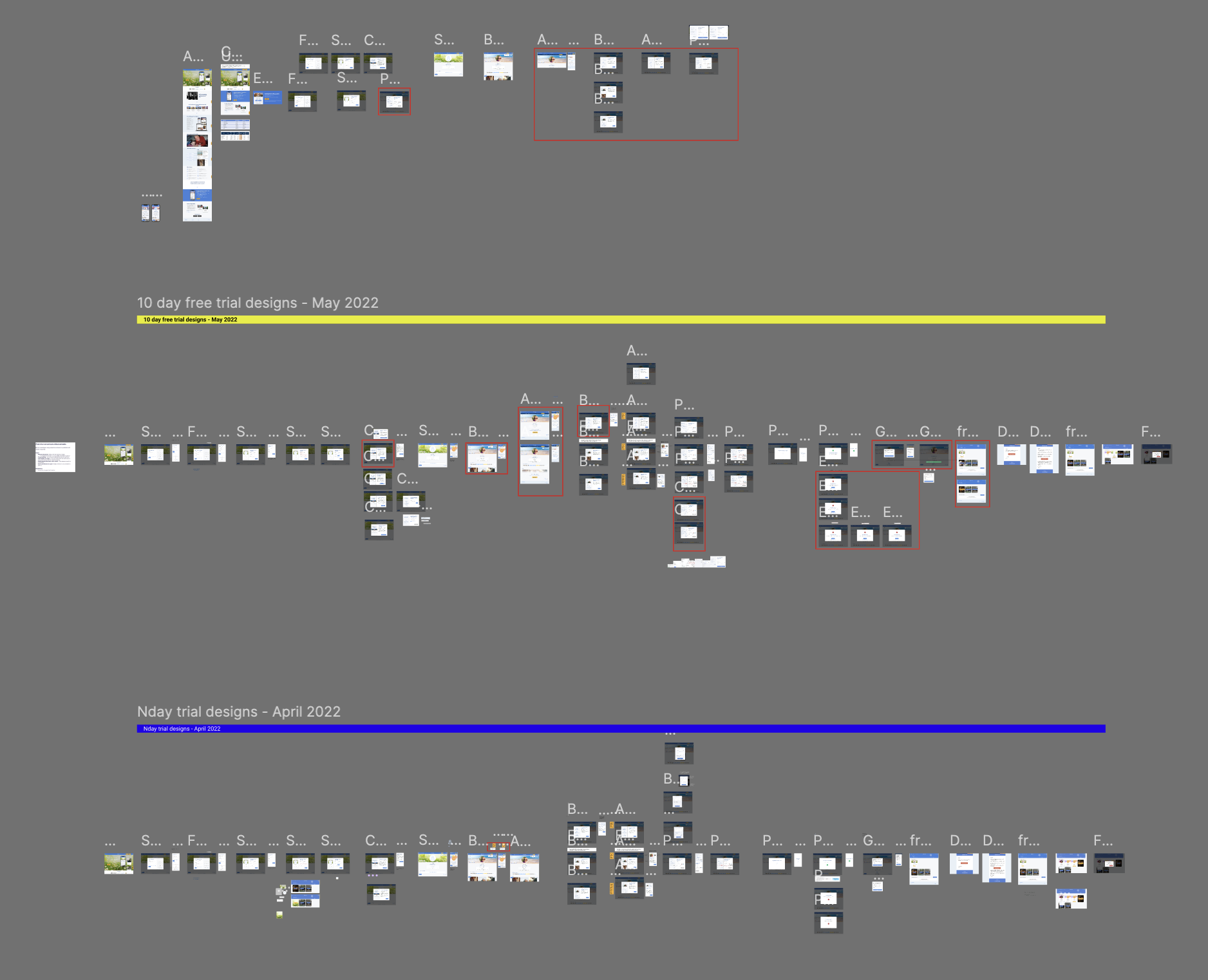
Design Process
My Role
Sole Product Designer, end-to-end — the first and only designer on this initiative, starting from zero with no prior research, no personas, and no understanding of the user journey. I owned research, persona frameworks, behaviour documentation, concept testing, metrics framework, and pilot strategy — working closely with engineering, data, marketing, stakeholders, and the Deakin University team.Quick note: I was new on the real estate industry, I need it get a
The Goal
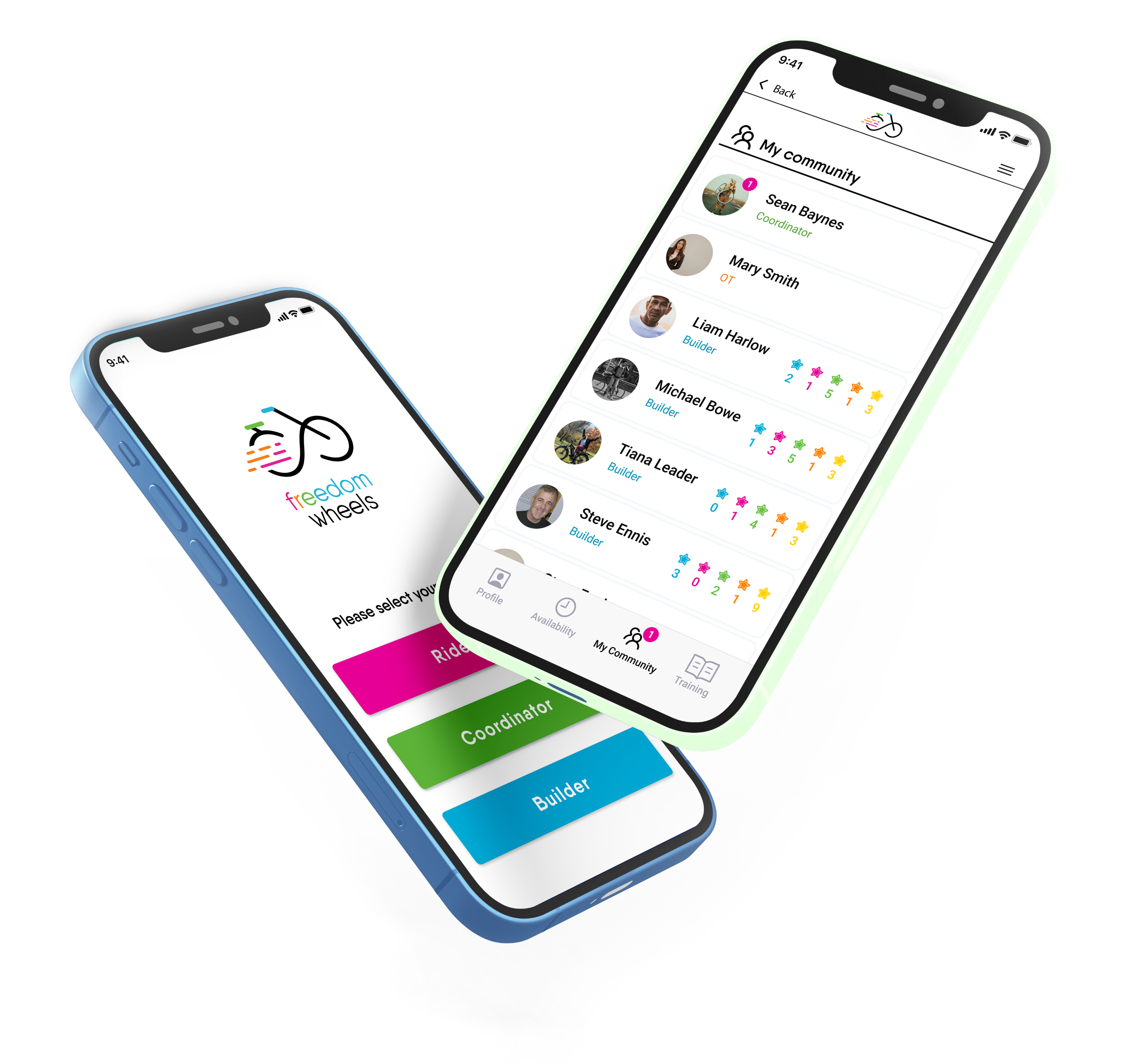
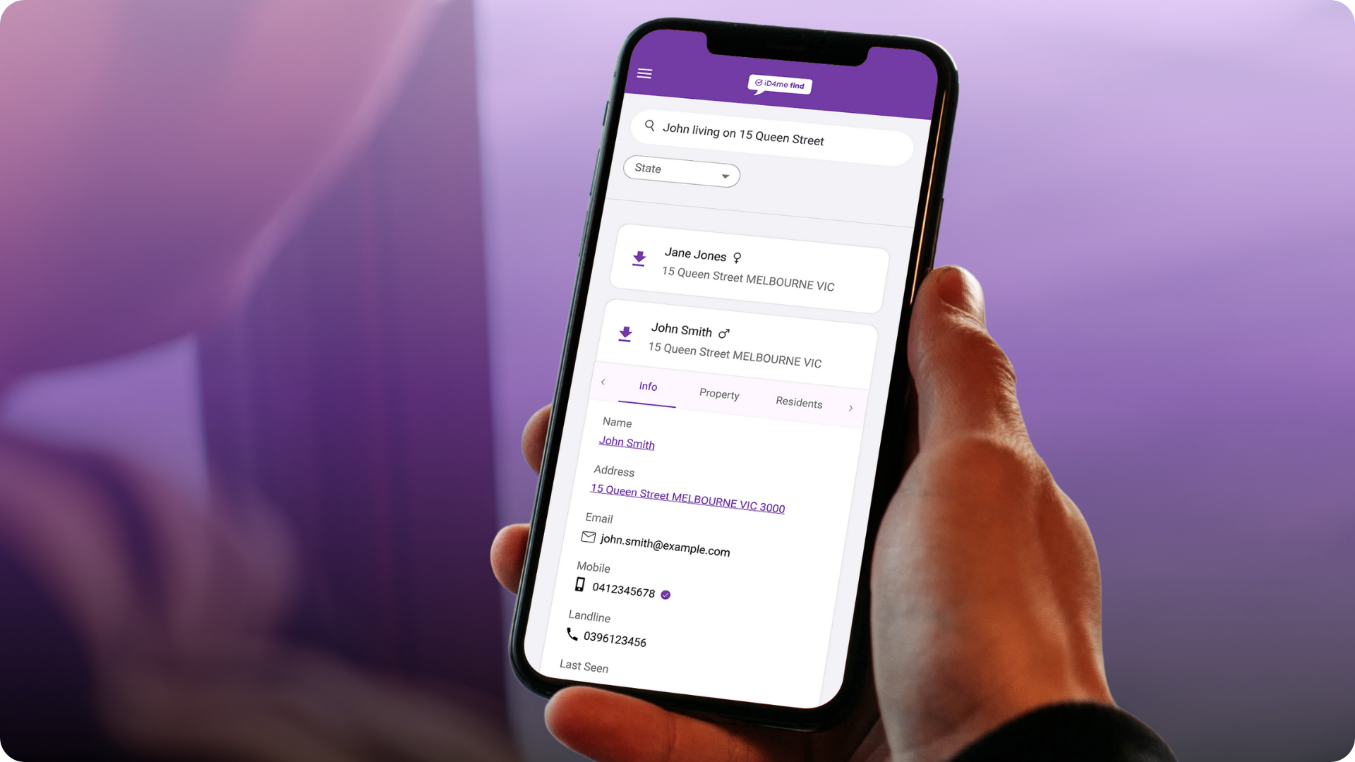
Replace transactional search with a natural language AI chat assistant that does the detective work for agents — role-specific, data-backed answers without filters or training, and a reason to stay on the platform.
Double Diamond
Design Process
Discovery
Kick-off workshop
User data segmentation
Product audit
User interviews
Design system
Testing: Wizard OZ method
Prototype iteration
Pilot strategy
Synthesise insights
Persona Journey map
Product vision & ideation
Roadmap ideas & prioritisation
Build
Key Adesigns: compliance, tone...
Usability testing: iD4me classic vs AI
Define
Develop
Deliver

Discovery
Research
iD4me had 7,389 users and no picture of who they were. No personas, no segmentation, no prior research. I started by building that foundation.
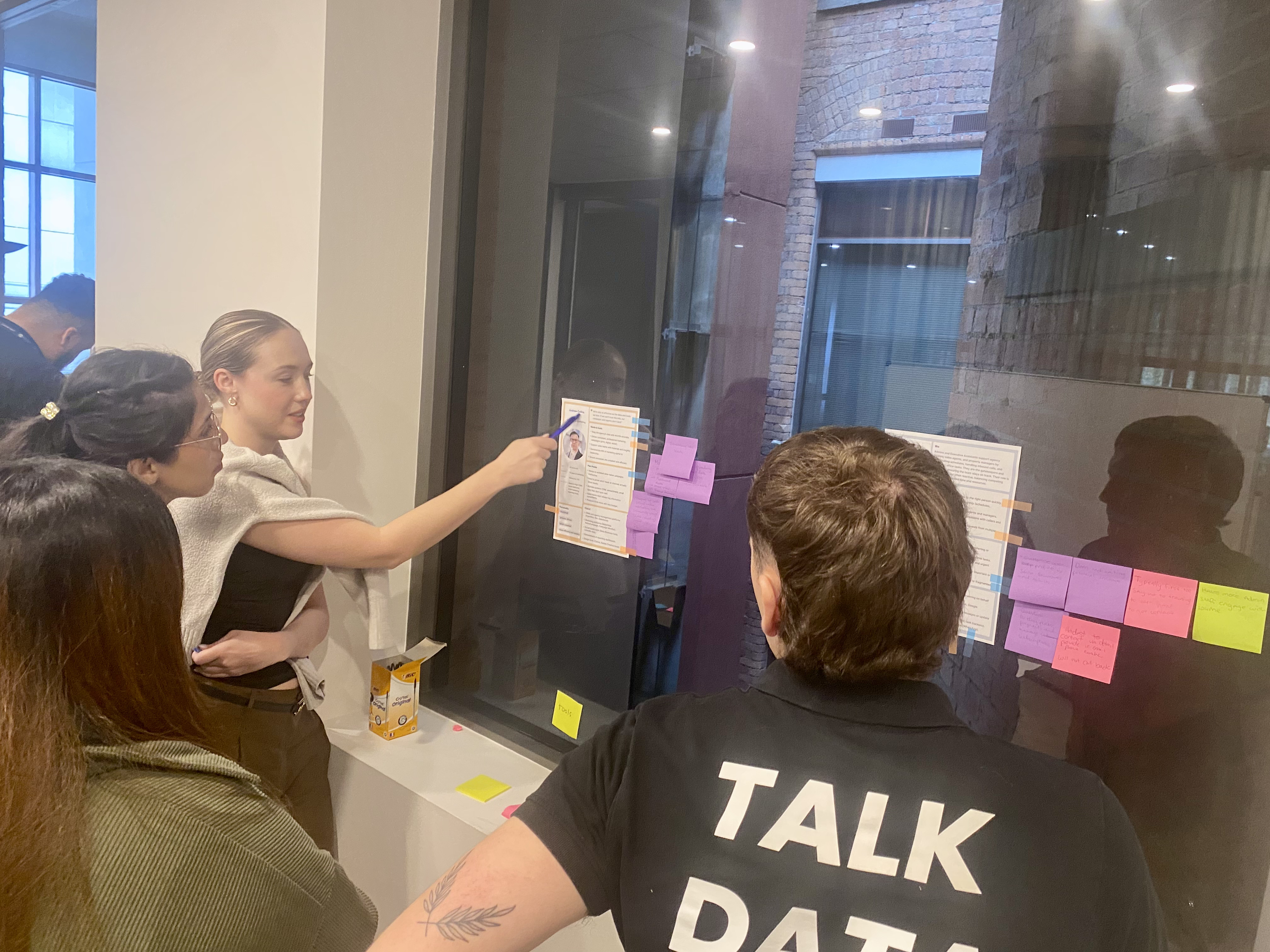
- Sales team workshops
I started with iD4me's key stakeholders — focusing on the sales team, who were closest to customers and several had real estate expertise. Two sessions: the first to define key user personas, their needs and pain points. The second to map their journey — from arriving at iD4me through to how they prospect and their different workflows.
A fast, cost-effective way to align the business on who to prioritise the product for before a single user was interviewed.
- User data analysis and segmentation
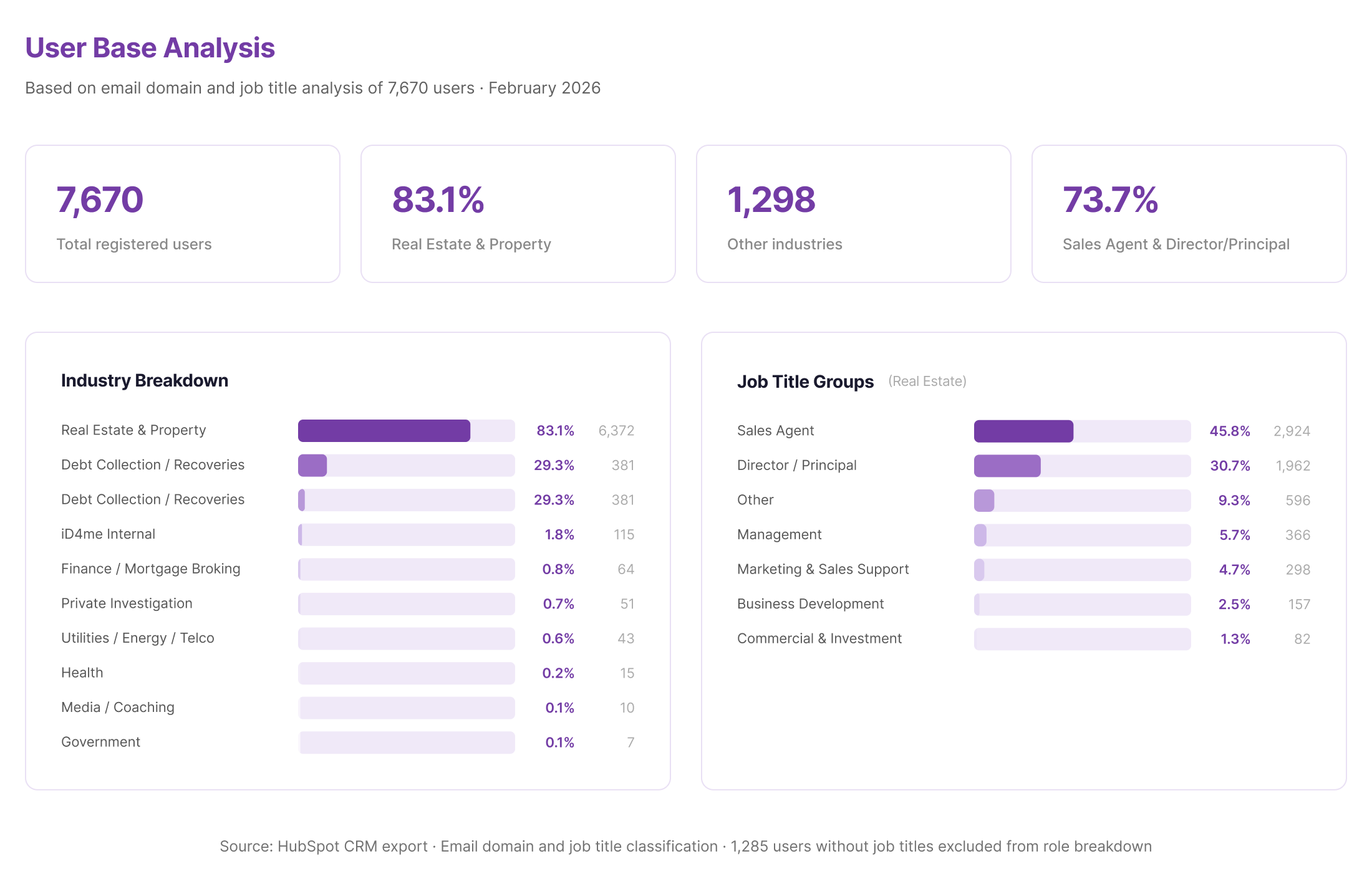
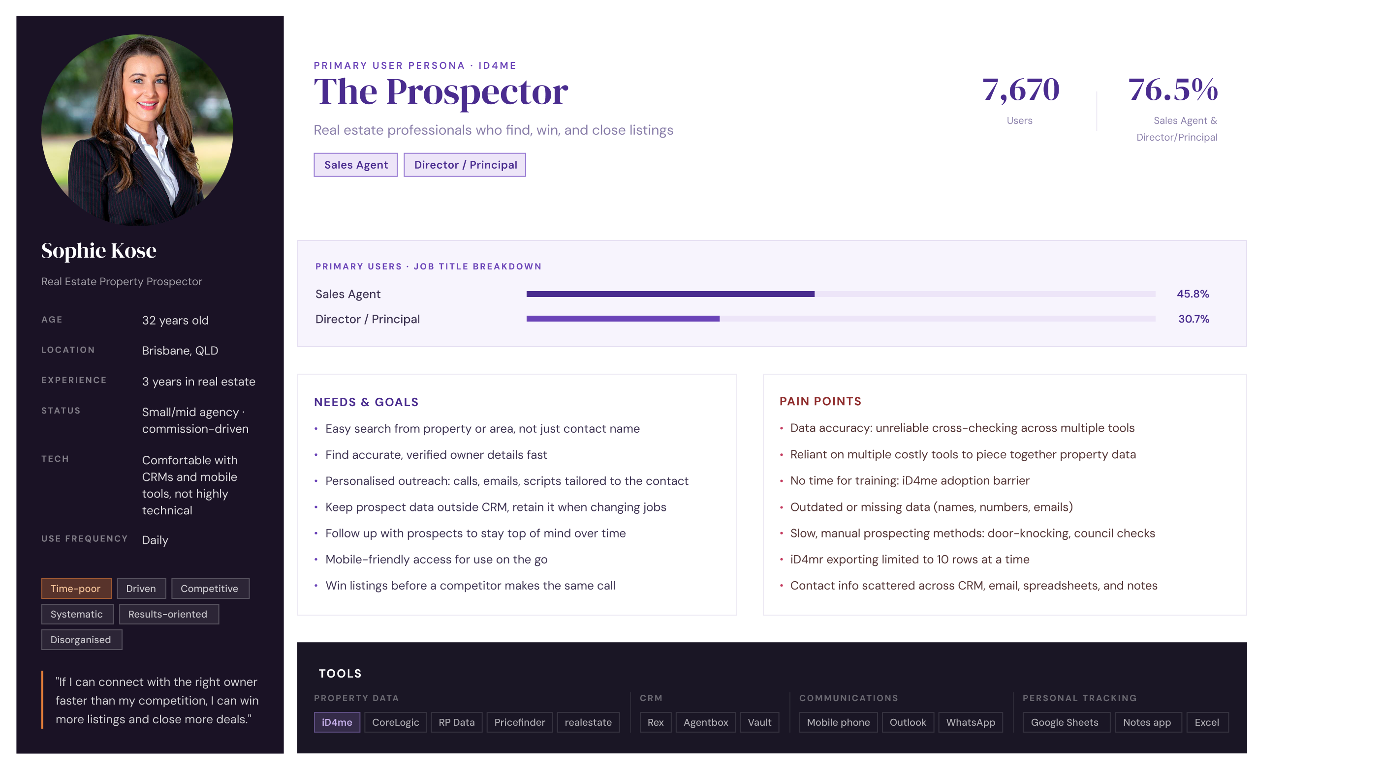
Once we knew who to target, I needed the numbers to back it up. I segmented all 7,389 users by role — identifying which industries they were coming from and defining the key segments to prioritise. Of 6,465 with a recorded job title, 5,304 matched prospecting roles. That defined exactly who we were building for.
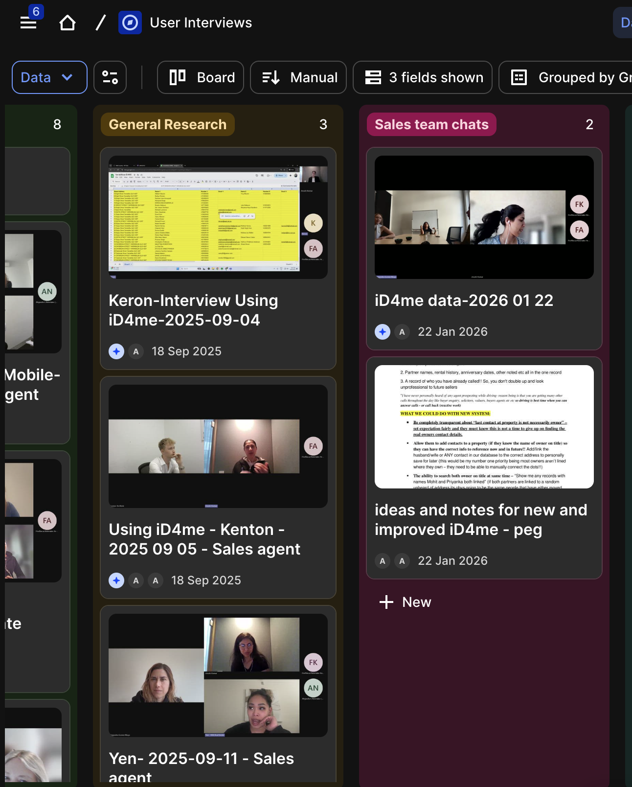
- User interviews
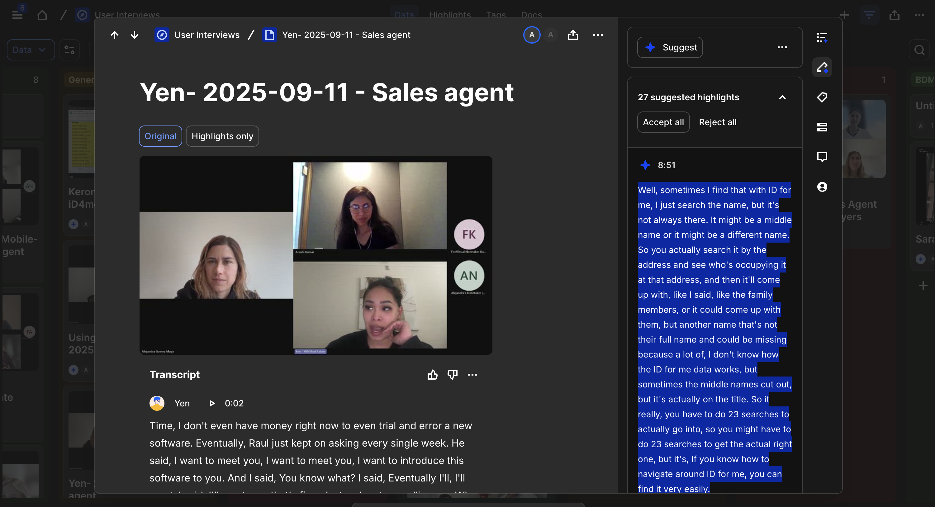
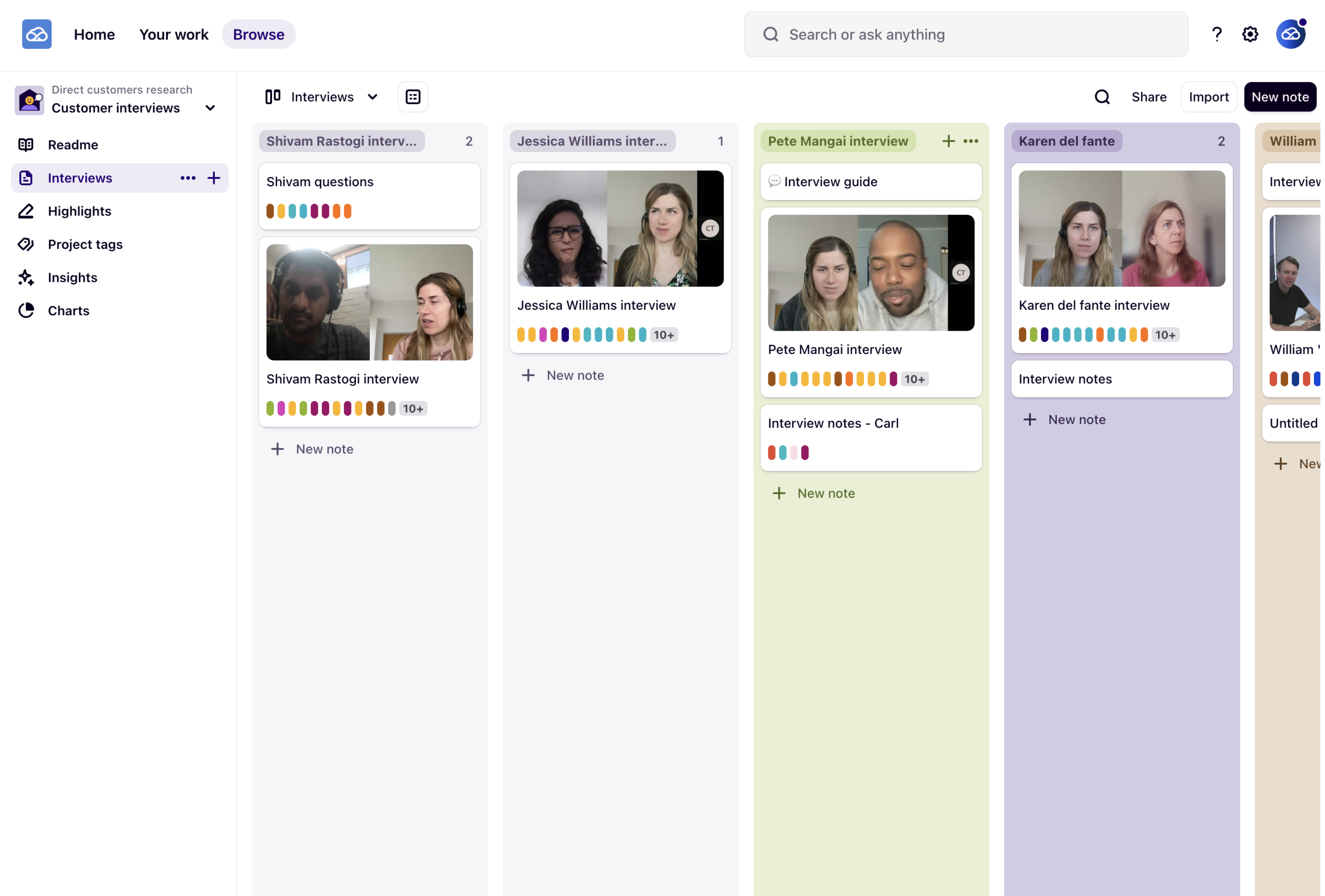
Once we defined our key users, I needed to validate my assumptions and understand them in depth. I conducted 12 interviews — 6 sales agents, 7 principals and business owners, 1 buyers agent, and 1 industry mentor who is a well-known BDM specialist and REB Innovator of the Year 2025.
Note: I was new to the real estate industry, so I needed to quickly build domain knowledge alongside the research.
Key problems identified
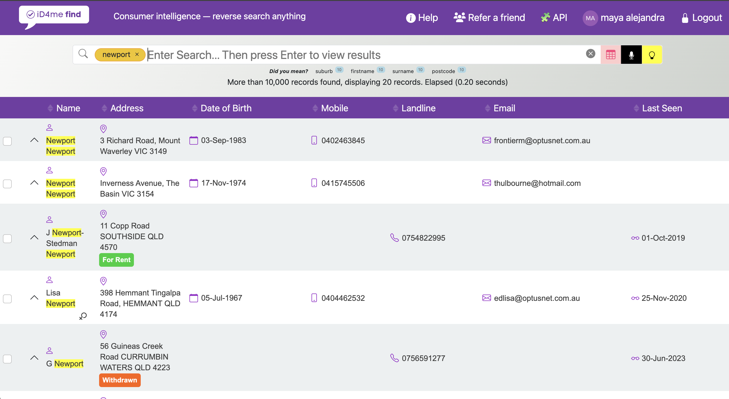
- Users couldn't search the way they actually think
Agents prospect by farming streets and areas — they start with a location and work toward a contact. The platform worked best when you already knew the person's name. Agents rarely do.
- Too many searches to find one contact
Finding the right contact meant running multiple queries across different tools — partial names, spelling variations, conflicting results. Too much time before a single call was made.
- The product required training to use
Users had to know the right syntax, filters, and order. Natural language removed that learning curve and reduced load on the support team.
- Users had to do a detective work
Figuring out which "John Smith" is the right one, or whether a number is current — that was on the agent. The product needed to surface the most likely match.
- Agents didn't know what iD4me could do
Most users thought of iD4me as a contact lookup tool. But the platform holds comprehensive property data. That value was invisible to most users.
Product Ideation & Direction
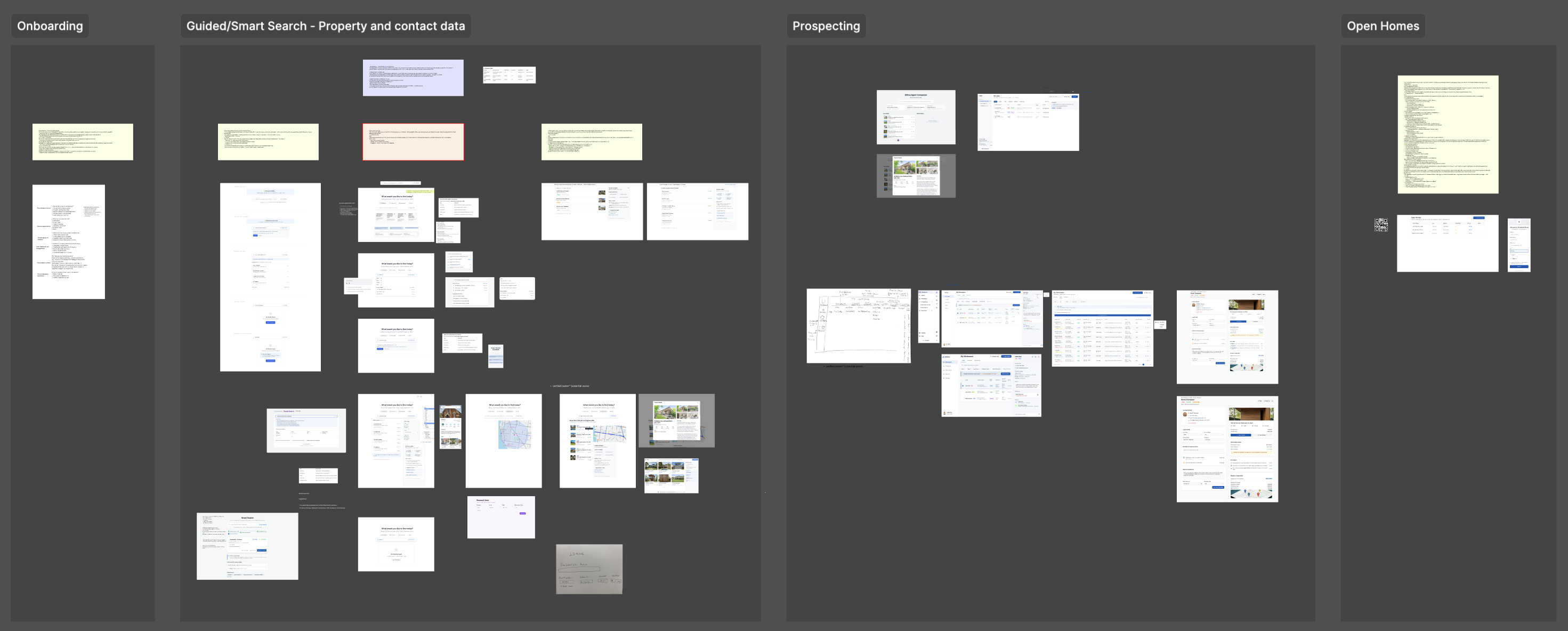
With research done and problems defined, the next step was generating ideas. I mapped product opportunities across four areas: onboarding, guided search, prospecting, and open home opportunities. I extracted ideas from the journey map and turned them into quick mock-ups using AI, sometimes just prompts to explain an idea, sometimes sketches. A lot of back and forth and brainstorming.
Then we aligned on direction. First a session with the product manager, then with key stakeholders, reviewing ideas against the product vision. After several rounds of refinement, the decision was made: iD4me was going AI-first.
That changed everything. Instead of solving each problem separately, we had one product direction: an AI prospecting assistant. Conversational search. Detective work done for the agent. The right contact surfaced at the right time. Users searching the way they actually think.
That decision was the foundation for everything that followed.
Product ideas.
- Concept Testing Insights
I reviewed why iD4me was growing alongside what was missing — to understand what to keep while improving. The goal: enhance the platform without breaking what users already relied on.
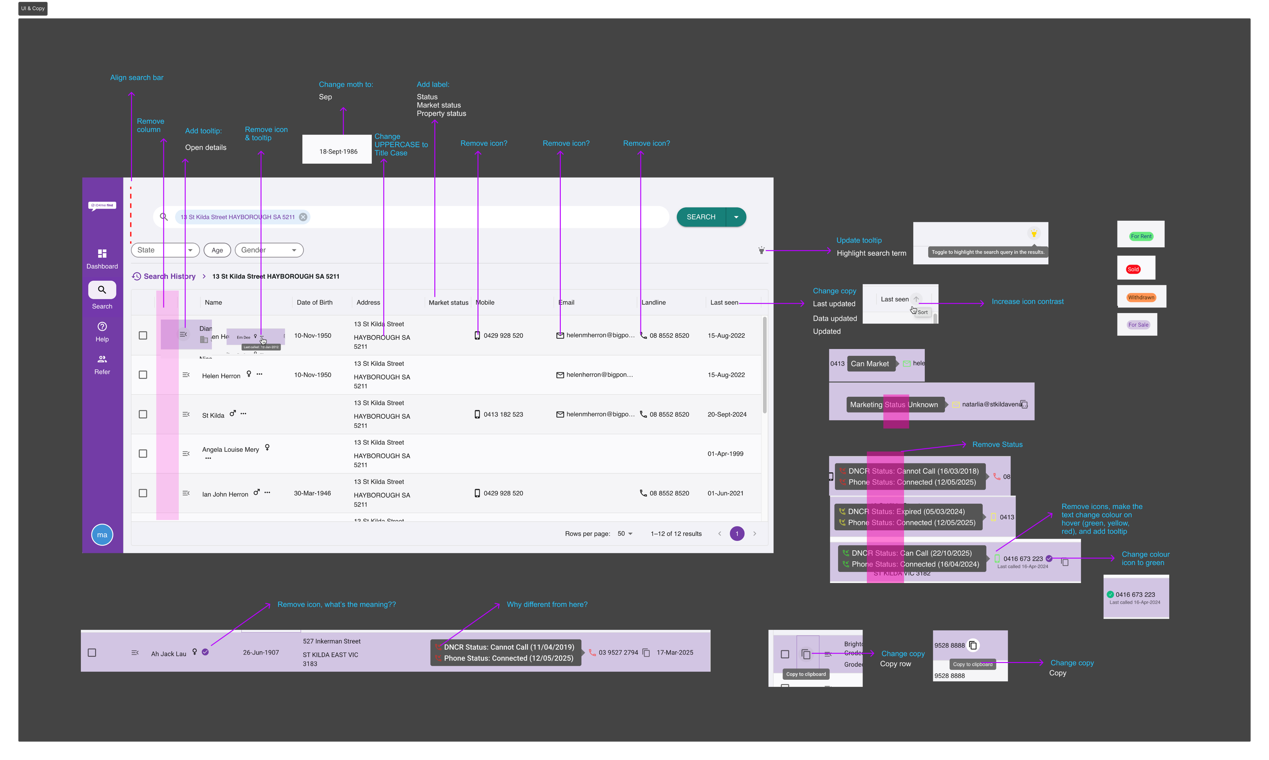
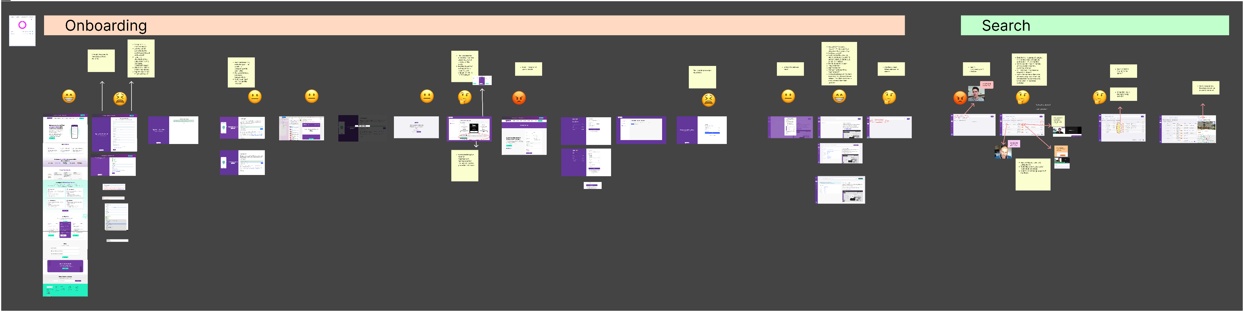
I mapped the full onboarding and search flow, annotating each step with sentiment to identify where users were confused, frustrated, or dropping off. I also ran a detailed UI and copy audit of the search interface — flagging inconsistencies across labels, icons, status indicators, and microcopy.
Key findings
- No clear starting point for first-time users
- UI elements designed for power users, not new ones
- Information hierarchy didn't match how agents scan and prioritise
- No intuitive path from landing to first value
Memorial owner
User Persona
Memorial Owner — initiates and manages the memorial and invites others to contribute.
Journey Map
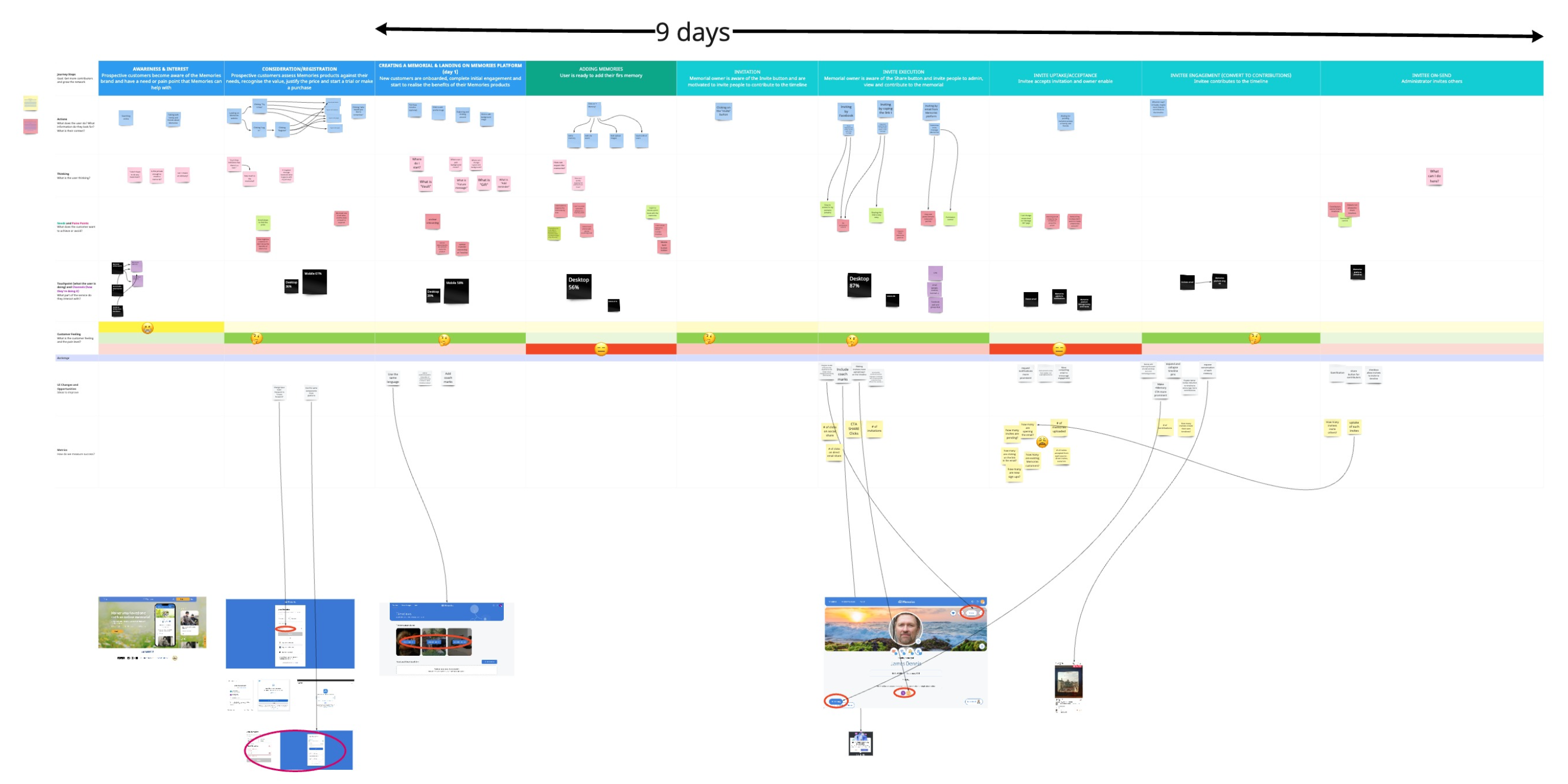
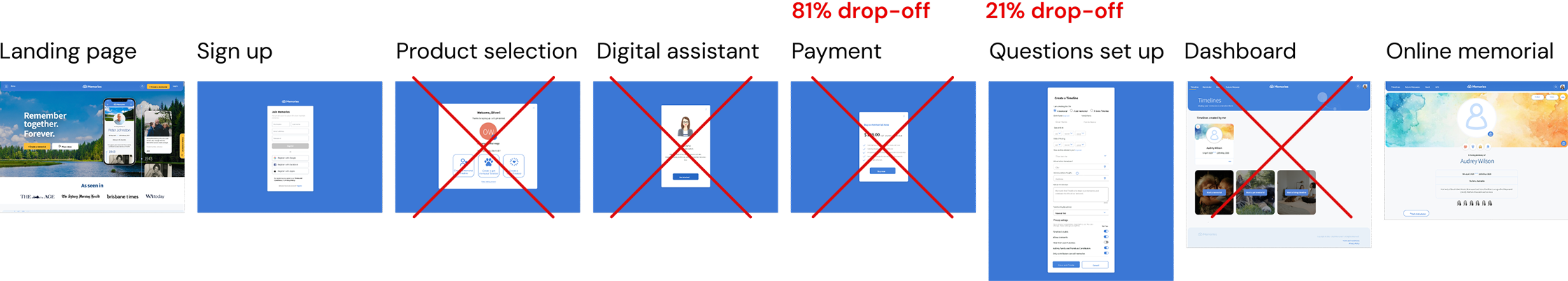
Mapped the journey of a typical Memorial Owner from discovering the service to creating a memorial,highlighting pain points such as complex onboarding and unclear value proposition during the initial experience.
Designing iD4me AI Chat
Proposed User Flow
With research done and problems defined, the next step was generating ideas. I mapped product opportunities across four areas: onboarding, guided search, prospecting, and open home opportunities. I extracted ideas from the journey map and turned them into quick mock-ups using AI, sometimes just prompts to explain an idea, sometimes sketches. A lot of back and forth and brainstorming.
Then we aligned on direction. First a session with the product manager, then with key stakeholders, reviewing ideas against the product vision. After several rounds of refinement, the decision was made: iD4me was going AI-first.
That changed everything. Instead of solving each problem separately, we had one product direction: an AI prospecting assistant. Conversational search. Detective work done for the agent. The right contact surfaced at the right time. Users searching the way they actually think.
That decision was the foundation for everything that followed.

Proposed UX Redesign
1. Website Enhancements:
- Refined website copy to be more supportive, reassuring, warm, and empathetic.
- Introduced softer visual elements and calming colours.
- Clearly emphasised core benefits: easy setup, private & secure, collaborative, one-time payment.
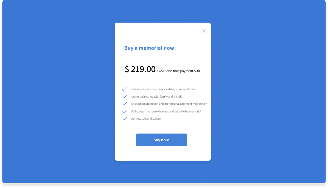
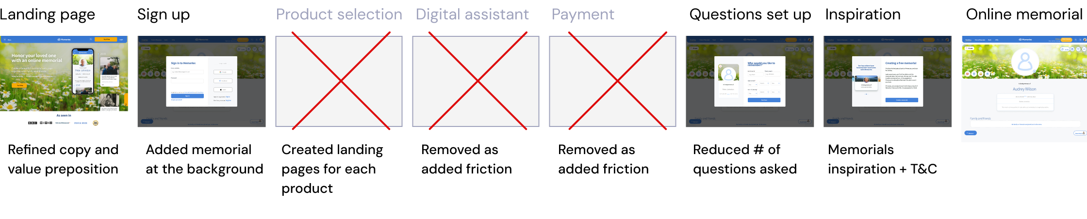
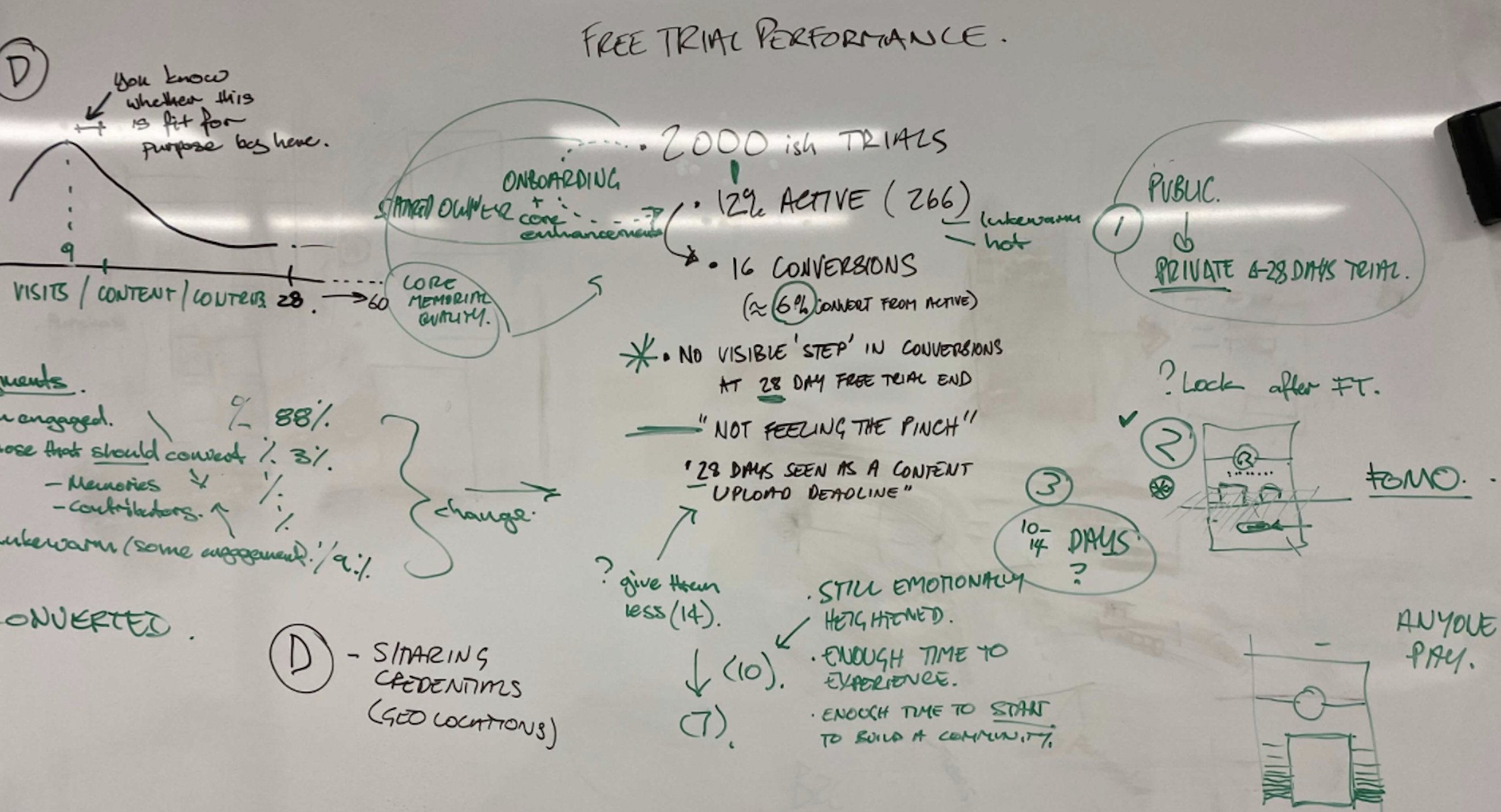
2. Introducing a Free Trial:
- Eliminated upfront payment, launching a 28-day free trial.
- Added prompts highlighting memorial and trial benefits throughout the user journey.
- Clearly outlined trial terms to manage expectations.
- Presented a memorial summary pre-payment to showcase its built value.
3. Optimising Onboarding Flow:
- Streamlined onboarding from 6 to 3 steps for smooth, more user-friendly experience.
- Simplified sign-up by removing non-essential fields (e.g., "hometown").
- Added sample memorials for inspiration and clarity.
- Integrated an interactive memorial preview in the background for a more immersive experience.
4. UX & Accessibility Considerations:
- With 61% of users creating memorials on mobile, so we prioritised a mobile-first approach to ensure a consistent, responsive experience across devices.
- To support our primary users—older adults with low digital literacy—and meet WCAG Level AA standards (recommended mid-level accessibility), we:
- Reviewed colour choices to ensure sufficient contrast and optimal readability
- Maintained consistent navigation and clear error suggestions
- Implemented larger fonts with a minimum size of 16px
- Designed bigger touch targets (buttons), especially for mobile users
After Six Weeks
Results
Following the launch of the free trial, improved onboarding and the Memories website, we saw significant results within six weeks:
- Improved Conversion Rate: +6%
- Increased Sign-Ups: +28%
- Higher Activation Rate: +12%
Iterations
Based on ongoing analysis of user feedback and product metrics, we continuously refined the experience to better meet user and business needs.
- Reduced Free Trial Duration: Shortened from 28 to 14 days to encourage quicker conversion.
- Increased Pricing Visibility: Moved pricing information higher on the website for earlier clarity.
- Onboarding Product Explainer Video: Added to quickly convey value and features.
- Guided Onboarding: Implemented contextual tooltips for step-by-step user guidance.
KEY
Learnings
- Combining qualitative insights with quantitative validation uncovers real user pain points and informs user-centred design solutions that deliver measurable business impact.
- Storytelling helped make research insights more engaging and actionable for stakeholders.
- Early cross-functional collaboration ensures design changes align with broader business goals.
- Iterative design (progress over perfection) enables continuous improvement.
NEXT CASE STUDY
IKEA Digital Touchpoints


An AI prospecting assistant for real estate
iD4me PropTech Platform
CLIENT
iD4me · PropTech, AU/NZ
ROLE
Product designer (UX/UI, research)
STATUS
In progress · Pilot Aug 2026
TEAM
Product, Dev, Data, Marketing, CEO, Deakin University
LOCATION
Melbourne
oUTPUT
- Platform redesign: AI prospecting assistant
the problem
Design Process
In 2021, Memories moved to a paid-only model for its core product, the online memorial. This led to a significant drop in sign-ups, activations, and conversions.
We identified two key issues beyond pricing: many users struggled to understand the product’s value, which increased refund requests, and requiring upfront payment before users understood its purpose created hesitation, especially given the product’s sensitive nature.
My Role
Sole Product Designer, end-to-end — the first and only designer on this initiative, starting from zero with no prior research, no personas, and no understanding of the user journey. I owned research, persona frameworks, behaviour documentation, concept testing, metrics framework, and pilot strategy — working closely with engineering, data, marketing, stakeholders, and the Deakin University team.Quick note: I was new on the real estate industry, I need it get a
The Goal
Replace transactional search with a natural language AI chat assistant that does the detective work for agents — role-specific, data-backed answers without filters or training, and a reason to stay on the platform.
Double Diamond
Design Process
Discovery
Kick-off workshop
User data segmentation
Product audit
User interviews
Design system
Testing: Wizard OZ method
Prototype iteration
Pilot strategy
Synthesise insights
Persona Journey map
Product vision & ideation
Roadmap ideas & prioritisation
Build
Key Adesigns: compliance, tone...
Usability testing: iD4me classic vs AI
Define
Develop
Deliver

Discovery
Research
iD4me had 7,389 users and no picture of who they were. No personas, no segmentation, no prior research. I started by building that foundation.
- Sales team workshops
I started with iD4me's key stakeholders — focusing on the sales team, who were closest to customers and several had real estate expertise. Two sessions: the first to define key user personas, their needs and pain points. The second to map their journey — from arriving at iD4me through to how they prospect and their different workflows.
A fast, cost-effective way to align the business on who to prioritise the product for before a single user was interviewed.
- User data analysis and segmentation
Once we knew who to target, I needed the numbers to back it up. I segmented all 7,389 users by role — identifying which industries they were coming from and defining the key segments to prioritise. Of 6,465 with a recorded job title, 5,304 matched prospecting roles. That defined exactly who we were building for.
- User interviews
Once we defined our key users, I needed to validate my assumptions and understand them in depth. I conducted 12 interviews — 6 sales agents, 7 principals and business owners, 1 buyers agent, and 1 industry mentor who is a well-known BDM specialist and REB Innovator of the Year 2025.
Note: I was new to the real estate industry, so I needed to quickly build domain knowledge alongside the research.
Key problems identified
- Users couldn't search the way they actually think
Agents prospect by farming streets and areas — they start with a location and work toward a contact. The platform worked best when you already knew the person's name. Agents rarely do.
- Too many searches to find one contact
Finding the right contact meant running multiple queries across different tools — partial names, spelling variations, conflicting results. Too much time before a single call was made.
- The product required training to use
Users had to know the right syntax, filters, and order. Natural language removed that learning curve and reduced load on the support team.
- Users had to do a detective work
Figuring out which "John Smith" is the right one, or whether a number is current — that was on the agent. The product needed to surface the most likely match.
- Agents didn't know what iD4me could do
Most users thought of iD4me as a contact lookup tool. But the platform holds comprehensive property data. That value was invisible to most users.
- Concept Testing Insights
I reviewed why iD4me was growing alongside what was missing — to understand what to keep while improving. The goal: enhance the platform without breaking what users already relied on.
I mapped the full onboarding and search flow, annotating each step with sentiment to identify where users were confused, frustrated, or dropping off. I also ran a detailed UI and copy audit of the search interface — flagging inconsistencies across labels, icons, status indicators, and microcopy.
Key findings
- No clear starting point for first-time users
- UI elements designed for power users, not new ones
- Information hierarchy didn't match how agents scan and prioritise
- No intuitive path from landing to first value
- A/B Testing & Data-Driven Optimisation
Test 1: CTA Button Language
- Concept Testing Findings Used: Users responded more positively to wording that emphasised the trial rather than the memorial creation.
- Hypothesis: A more descriptive and action-driven CTA would encourage more sign-ups.
- Variation A: “Try it free”
- Variation B: “Create a memorial for free”
- Result: Variation A (Try it free) performed better in sign-ups.
Test 2: Homepage Layout
- Concept Testing Findings Used: Early testing suggested that trust-building elements, such as testimonials, could play a crucial role in influencing purchase decisions.
- Hypothesis: Placing the testimonials section at the top would increase trust and incentivise the purchase process and increase conversions.
- Variation A: Payment section displayed at the top of the page.
- Variation B: Testimonials displayed at the top of the page.
- Result: Variation B (testimonials first) led to increase in conversion rates.
User Persona
Product Ideation & Direction
With research done and problems defined, the next step was generating ideas. I mapped product opportunities across four areas: onboarding, guided search, prospecting, and open home opportunities. I extracted ideas from the journey map and turned them into quick mock-ups using AI, sometimes just prompts to explain an idea, sometimes sketches. A lot of back and forth and brainstorming.
Then we aligned on direction. First a session with the product manager, then with key stakeholders, reviewing ideas against the product vision. After several rounds of refinement, the decision was made: iD4me was going AI-first.
That changed everything. Instead of solving each problem separately, we had one product direction: an AI prospecting assistant. Conversational search. Detective work done for the agent. The right contact surfaced at the right time. Users searching the way they actually think.
That decision was the foundation for everything that followed.
Product ideas.
Journey Map
Mapped the journey of a typical Memorial Owner from discovering the service to creating a memorial,highlighting pain points such as complex onboarding and unclear value proposition during the initial experience.
Designing iD4me AI Chat
Proposed User Flow
With research done and problems defined, the next step was generating ideas. I mapped product opportunities across four areas: onboarding, guided search, prospecting, and open home opportunities. I extracted ideas from the journey map and turned them into quick mock-ups using AI, sometimes just prompts to explain an idea, sometimes sketches. A lot of back and forth and brainstorming.
Then we aligned on direction. First a session with the product manager, then with key stakeholders, reviewing ideas against the product vision. After several rounds of refinement, the decision was made: iD4me was going AI-first.
That changed everything. Instead of solving each problem separately, we had one product direction: an AI prospecting assistant. Conversational search. Detective work done for the agent. The right contact surfaced at the right time. Users searching the way they actually think.
That decision was the foundation for everything that followed.
Proposed UX Redesign
1. Website Enhancements:
- Refined website copy to be more supportive, reassuring, warm, and empathetic.
- Introduced softer visual elements and calming colours.
- Clearly emphasised core benefits: easy setup, private & secure, collaborative, one-time payment.
2. Introducing a Free Trial:
- Eliminated upfront payment, launching a 28-day free trial.
- Added prompts highlighting memorial and trial benefits throughout the user journey.
- Clearly outlined trial terms to manage expectations.
- Presented a memorial summary pre-payment to showcase its built value.
3. Optimising Onboarding Flow:
- Streamlined onboarding from 6 to 3 steps for smooth, more user-friendly experience.
- Simplified sign-up by removing non-essential fields (e.g., "hometown").
- Added sample memorials for inspiration and clarity.
- Integrated an interactive memorial preview in the background for a more immersive experience.
4. UX & Accessibility Considerations:
- With 61% of users creating memorials on mobile, so we prioritised a mobile-first approach to ensure a consistent, responsive experience across devices.
- To support our primary users—older adults with low digital literacy—and meet WCAG Level AA standards (recommended mid-level accessibility), we:
- Reviewed colour choices to ensure sufficient contrast and optimal readability
- Maintained consistent navigation and clear error suggestions
- Implemented larger fonts with a minimum size of 16px
- Designed bigger touch targets (buttons), especially for mobile users
After Six Weeks
Results
Following the launch of the free trial, improved onboarding and the Memories website, we saw significant results within six weeks:
- Improved Conversion Rate: +6%
- Increased Sign-Ups: +28%
- Higher Activation Rate: +12%
Iterations
Based on ongoing analysis of user feedback and product metrics, we continuously refined the experience to better meet user and business needs.
- Reduced Free Trial Duration: Shortened from 28 to 14 days to encourage quicker conversion.
- Increased Pricing Visibility: Moved pricing information higher on the website for earlier clarity.
- Onboarding Product Explainer Video: Added to quickly convey value and features.
- Guided Onboarding: Implemented contextual tooltips for step-by-step user guidance.
KEY
Learnings
- Combining qualitative insights with quantitative validation uncovers real user pain points and informs user-centred design solutions that deliver measurable business impact.
- Storytelling helped make research insights more engaging and actionable for stakeholders.
- Early cross-functional collaboration ensures design changes align with broader business goals.
- Iterative design (progress over perfection) enables continuous improvement.
NEXT CASE STUDY
IKEA Digital Touchpoints

An AI prospecting assistant for real estate
iD4me PropTech Platform
CLIENT
iD4me · PropTech, AU/NZ
ROLE
Senior product designer (UX/UI, research, strategy)
STATUS
In progress · Pilot Aug 2026
TEAM
Product, Dev, Data, Marketing, CEO, Deakin University
LOCATION
Melbourne
oUTPUT
- Platform redesign: AI prospecting assistant
the problem
Context
iD4me is a powerful PropTech database used daily by real estate agents across Australia and New Zealand. Agents use it alongside other property tools to find ownership contact details and property data — but the data is raw, which means they had to do the detective work themselves, cross-referencing multiple tools and cues to find the right contact.
The existing search worked well for name-based lookups, but agents don't start from a name. They start from a property, a street, or a suburb and work toward a contact. The experience didn't match how agents actually think.
My Role
Sole Product Designer, end-to-end — the first and only designer on this initiative, starting from zero with no prior research, no personas, and no understanding of the user journey. I owned research, persona frameworks, behaviour documentation, concept testing, metrics framework, and pilot strategy — working closely with engineering, data, marketing, stakeholders, and the Deakin University team.
Goal
Replace transactional search with a natural language AI chat assistant that does the detective work for agents — role-specific, data-backed answers without filters or training, and a reason to stay on the platform.
Double Diamond
Design Framework
Discovery
Sales workshops
User data analysis
User interviews
Product audit
Design system
Wizard of Oz testing
Prototype iteration
Pilot strategy
Persona synthesis
Journey mapping
Product vision & ideation
Feature prioritisation
AI design & behaviour docs
Usability testing
Pilot → MVP
Define
Develop
Deliver

Discovery
Understanding the Users
iD4me had 7,389 users and no picture of who they were. No personas, no segmentation, no prior research. I started by building that foundation.
- Sales team workshops
Before interviewing any users, I used AI to generate proto-personas — early hypotheses about who our users are, based on my initial understanding of the domain. I printed them, put them on the wall, and ran two workshop sessions with the sales team and key stakeholders.
The first session validated the proto-personas with sticky notes. Confirming, challenging, and adding to each one. The second mapped the user journey from arriving at iD4me through to how agents prospect day-to-day.
A fast, cost-effective way to align the business on who to prioritise before a single user was interviewed.
- User data analysis and segmentation
Once we knew who to target, I needed the numbers to back it up. I segmented all 7,389 users by role — identifying which industries they were coming from and defining the key segments to prioritise. Of 6,465 with a recorded job title, 5,304 matched prospecting roles. That defined exactly who we were building for.
- User interviews
Once we defined our key users, I needed to validate my assumptions and understand them in depth. I conducted 12 interviews — 6 sales agents, 7 principals and business owners, 1 buyers agent, and 1 industry mentor who is a well-known BDM specialist and REB Innovator of the Year 2025.
Note: I was new to the real estate industry, so I needed to quickly build domain knowledge alongside the research.
Key problems identified
- Users couldn't search the way they actually think
Agents prospect by farming streets and areas — they start with a location and work toward a contact. The platform worked best when you already knew the person's name. Agents rarely do.
- Too many searches to find one contact
Finding the right contact meant running multiple queries across different tools — partial names, spelling variations, conflicting results. Too much time before a single call was made.
- The experience was too transactional
Users would subscribe, extract contacts into their CRM, then cancel — returning only when they needed fresh data. Nothing in the platform gave them a reason to stay.
- The product required training to use
Users had to know the right syntax, filters, and order. Natural language removed that learning curve and reduced load on the support team.
- Users had to do a detective work
Figuring out which "John Smith" is the right one, or whether a number is current — that was on the agent. The product needed to surface the most likely match.
- Agents didn't know what iD4me could do
Most users thought of iD4me as a contact lookup tool. But the platform holds comprehensive property data. That value was invisible to most users.
- Auditing the existing experience
I reviewed why iD4me was growing alongside what was missing — to understand what to keep while improving. The goal: enhance the platform without breaking what users already relied on.
I mapped the full onboarding and search flow, annotating each step with sentiment to identify where users were confused, frustrated, or dropping off. I also ran a detailed UI and copy audit of the search interface — flagging inconsistencies across labels, icons, status indicators, and microcopy.
Key findings
- No clear starting point for first-time users
- UI elements designed for power users, not new ones
- Information hierarchy didn't match how agents scan and prioritise
- No intuitive path from landing to first value
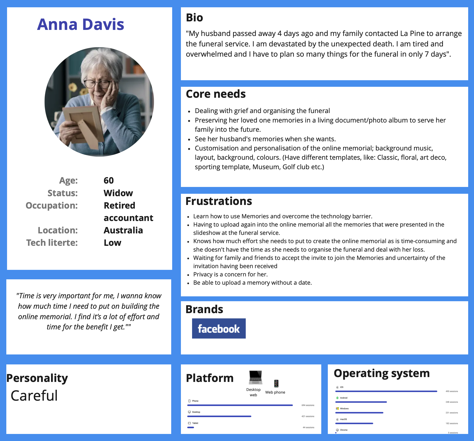
User Persona
Journey Map
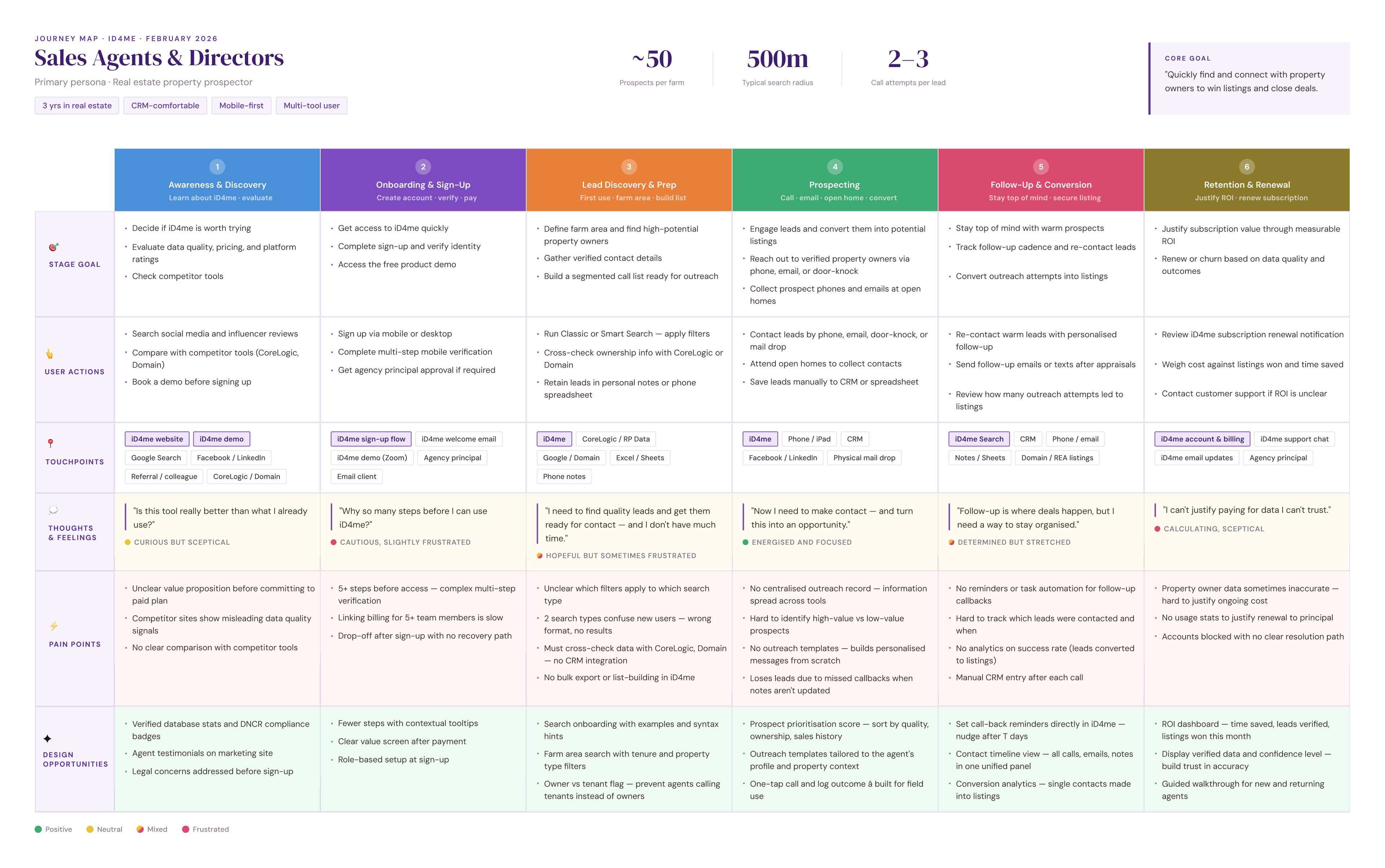
Real estate prospector journey map.
Product Ideation & Direction
With research done and problems defined, the next step was generating ideas. I mapped product opportunities across four areas: onboarding, guided search, prospecting, and open home opportunities. I extracted ideas from the journey map and turned them into quick mock-ups using AI, sometimes just prompts to explain an idea, sometimes sketches. A lot of back and forth and brainstorming.
Then we aligned on direction. First a session with the product manager, then with key stakeholders, reviewing ideas against the product vision. After several rounds of refinement, the decision was made: iD4me was going AI-first.
That changed everything. Instead of solving each problem separately, we had one product direction: an AI prospecting assistant. Conversational search. Detective work done for the agent. The right contact surfaced at the right time. Users searching the way they actually think.
That decision was the foundation for everything that followed.
Product ideas.
Designing iD4me AI Chat
6 key problems to
Product ideas.
Designing iD4me AI Chat
Proposed User Flow
With research done and problems defined, the next step was generating ideas. I mapped product opportunities across four areas: onboarding, guided search, prospecting, and open home opportunities. I extracted ideas from the journey map and turned them into quick mock-ups using AI, sometimes just prompts to explain an idea, sometimes sketches. A lot of back and forth and brainstorming.
Then we aligned on direction. First a session with the product manager, then with key stakeholders, reviewing ideas against the product vision. After several rounds of refinement, the decision was made: iD4me was going AI-first.
That changed everything. Instead of solving each problem separately, we had one product direction: an AI prospecting assistant. Conversational search. Detective work done for the agent. The right contact surfaced at the right time. Users searching the way they actually think.
That decision was the foundation for everything that followed.

Proposed UX Redesign
1. Website Enhancements:
- Refined website copy to be more supportive, reassuring, warm, and empathetic.
- Introduced softer visual elements and calming colours.
- Clearly emphasised core benefits: easy setup, private & secure, collaborative, one-time payment.
2. Introducing a Free Trial:
- Eliminated upfront payment, launching a 28-day free trial.
- Added prompts highlighting memorial and trial benefits throughout the user journey.
- Clearly outlined trial terms to manage expectations.
- Presented a memorial summary pre-payment to showcase its built value.
3. Optimising Onboarding Flow:
- Streamlined onboarding from 6 to 3 steps for smooth, more user-friendly experience.
- Simplified sign-up by removing non-essential fields (e.g., "hometown").
- Added sample memorials for inspiration and clarity.
- Integrated an interactive memorial preview in the background for a more immersive experience.
4. Responsiveness & Accessibility Considerations:
- With 61% of users creating memorials on mobile, so we prioritised a mobile-first approach to ensure a consistent, responsive experience across devices.
- To support our primary users—older adults with low digital literacy—and meet WCAG Level AA standards (recommended mid-level accessibility), we:
- Reviewed colour choices to ensure sufficient contrast and optimal readability
- Maintained consistent navigation and clear error suggestions
- Implemented larger fonts with a minimum size of 16px
- Designed bigger touch targets (buttons), especially for mobile users
After Six Weeks
Results
Following the launch of the free trial, improved onboarding and the Memories website, we saw significant results within six weeks:
- Improved Conversion Rate: +6%
- Increased Sign-Ups: +28%
- Higher Activation Rate: +12%
Iterations
Based on ongoing analysis of user feedback and product metrics, we continuously refined the experience to better meet user and business needs.
- Reduced Free Trial Duration: Shortened from 28 to 14 days to encourage quicker conversion.
- Increased Pricing Visibility: Moved pricing information higher on the website for earlier clarity.
- Onboarding Product Explainer Video: Added to quickly convey value and features.
- Guided Onboarding: Implemented contextual tooltips for step-by-step user guidance.
KEY
Learnings
- Combining qualitative insights with quantitative validation uncovers real user pain points and informs user-centred design solutions that deliver measurable business impact.
- Storytelling helped make research insights more engaging and actionable for stakeholders.
- Early cross-functional collaboration ensures design changes align with broader business goals.
- Iterative design (progress over perfection) enables continuous improvement.
NEXT CASE STUDY
IKEA Digital Touchpoints